What color is Taupe, exactly? Taupe is regarded as an intermediate shade between dark brown and gray with characteristics of both colors.
Taupe is a great foundation and accent color because it is a simple neutral. This muted shade is soothing in its understatement, maturity, and dependability.
You’ll probably have many more questions regarding this unusual shade, such as what taupe looks like, what shades of taupe there are, and what colors work well with the shade of taupe.
Today, we’re showcasing stunning spaces that use this gentle hue to encourage you to use it to complement your home and enlighten you on what taupe shades are.
What Is the Taupe Color?
The color taupe is a neutral shade with warm or cool undertones; neutrals mix to create muted, desaturated brownish colors by fusing opposite colors on the color wheel.
The Latin term Talpa, which means “mole,” and the French word taupe combine to form taupe, originally used to denote moleskin.
Taupe is a mix of black or red with yellow and green undertones. The color taupe can therefore be described as a warm gray, brownish-gray, or grayish-brown.
NOTE
The color wheel is the go-to tool for anyone working with color. A color wheel is a tool for visualizing colors. On the color wheel, split complements are the two hues next to a hue’s complementary colors.
What Is the Tone Color Variation of Taupe?
Look at the taupe hues with their available RGB and CMYK codes.
Dark Taupe Color

Source: colorbook.io
- Taupe Hex Code: #483c32
- CMYK Taupe Color Code (%): 0, 17, 31, 72
- RGB Taupe Color Code: 72, 60, 50
One of the first taupe hues to be recorded in A Dictionary of Color in the early 1900s is dark taupe.
The dark taupe gets its name because it is noticeably deeper when compared to other taupe hues. Dark taupe accent colors prevent the crisp white interior design from looking too clinical.
Light Taupe Color

Source: colorbook.io
- Taupe Hex Code: #b38B6d
- CMYK Taupe Color Code (%): 0, 22, 39, 30
- RGB Taupe Color Code: 179, 139, 109
This taupe color (light taupe) has a dark tan appearance. One of the Crayola pencils, known as the word Taupe, was made to look like light taupe color.
Lighter shades of brownish gray are more welcoming than the dark taupe shade.
Mauve Taupe Color

Source: plainbackground.com
- Taupe Hex Code: #915f6d
- CMYK Taupe Color Code (%): 0, 34, 25, 43
- RGB Taupe Color Code: 145, 95, 109
In the middle of the 1920s, this shade of taupe was originally identified as an English color name.
The hue is positively characterized as a warm taupe shade and can also be described as a darker reddish-gray tint.
Gray Taupe
Source: colorcombos.com
- Taupe Hex Code: #8b8589
- CMYK Taupe Color Code (%): 0, 4, 1, 45
- RGB Taupe Color Code: 139, 133, 137
Gray taupe can be characterized as a more gray-brown, darker taupe tint. When designing, it’s crucial to remember that this particular gray taupe has more pink undertones.
Taupe gray should go well with warmer tones (e.g., pink, yellow, and olive tones) and other gray shades.
Rose Taupe
Source: colorcombos.com
- Taupe Hex Code: #905d5d
- CMYK Taupe Color Code (%): 0, 35, 35, 44
- RGB Taupe Color Code: 144, 93, 93
A desaturated dark red color or a shade of red can be used to describe the rose taupe color.
When used as a contrast, this shade of taupe will complement a dark, desaturated cyan color well.
Purple Taupe

Source: plainbackground.com
- Taupe Hex Code: #50404d
- CMYK Taupe Color Code (%): 0, 20, 4, 69
- RGB Taupe Color Code: 80, 64, 77
This taupe color purple is richer and darker grayish-magenta and contrasts nicely with a deep shade of grayish-green.
Red, in this instance, barely outweighs green or blue in the RGB color code, which has almost equivalent proportions of each color.
NOTE
Taupe is a mute that is particularly useful in creating a color palette of flesh tones for art and illustration. Combine the primary colors of red, yellow, and blue using a color palette knife to create the taupe hue. Apply equal amounts of each. This ought to produce a dark brown shade.
What Are the Top 6 Benjamin Moore Taupe Paint Colors?
The top 6 taupe paint colors by Benjamin Moore are listed below:
- Driftwood 2107-40
- Weimaraner AF-155
- Indian River 985
- Smokey Taupe 983
- Brandon Beige 977
- Shaker Beige HC-45
NOTE
Painting outcomes can vary because different acrylic paint brands utilize different formulae to make mixtures. Because of their undertones, various shades will likewise produce varying effects. For instance, ultramarine blue has purple undertones, while cerulean blue has a green undertone.
Tips and Tricks to Use When Choosing the Right Taupe Shade
Before continuing, it’s essential to create a color taupe reference point. We won’t promise that everyone will stay on the same page.
Taupe Hex Code
#483C32 is the hex code for taupe. The color taupe provides a soft shade foundation.
Taupe is frequently used in cozy and inviting interior design with other neutral colors like tans and whites.
A red, pink, or yellow undertone can be found in warmer shades. On the other hand, cooler tones have a grey background with traces of yellow or green.
Shades of Taupe
A cooler taupe color would look great in a modern home, but you could also use it in a space with vintage design elements.
Because of its calming undertones, you’ll find that this color is also fit for bathrooms and bedrooms, where you should try to create a peaceful aura for anybody who utilizes the space.
Warm taupe would be the best color choice for a traditional or refined feel. Darker shades can be stylish and dependable but can also become depressive.
A muted color such as pastel pink, soft yellow, light green, or pale lavender works well, as does a bright fuchsia.
What Are Some Taupe Color Ideas Interior Designers Can Use?
Here are the most recent instances of how the taupe color may enhance your upcoming home design project into a gorgeous space.
1. Victorian Essence Bedroom Decor
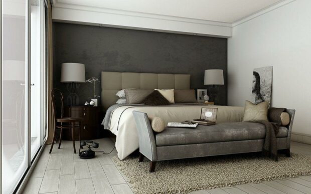
This complete bedroom was built with a Victorian feel in mind, and the taupe, gray, and cream color scheme was used to achieve that.
The focal point of this room is the layered colors. Gray and taupe differ from one another.
2. Taupe Luxurious Bathroom
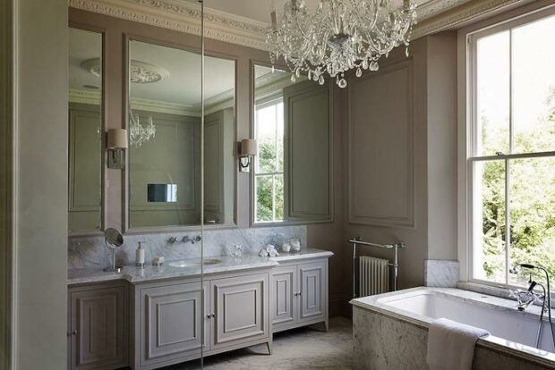
This elegant bathroom, which is feminine and full of taupe, is highlighted with a crystal chandelier. The name of the color, however, has a terrible reputation for being dull.
Taupe is the perfect base color for a bathroom since it makes the space soothing and chic.
It offers a tidy area for getting ready every morning and evening and is simple to match with white bathroom accessories and towels.
3. Taupe Accents
Of course, taupe also looks good in more formal spaces like living rooms or bedrooms. Yet, we are aware that this specific facility has an eclectic ethos.
4. Ultra Contemporary
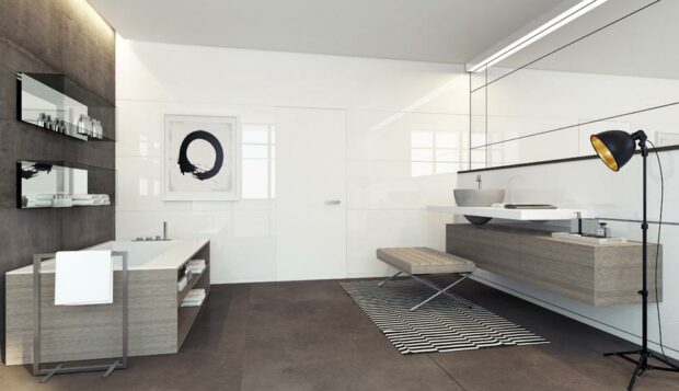
Now we have a new bathroom to admire and get design ideas from. The taupe finishes have a hipster vibe when paired with white walls.
5. Contrasting Finishes
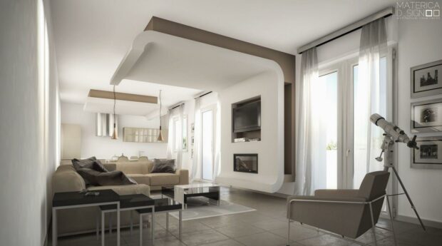
The accent outline of the 3-D wall, the corner chair, and the entire ivory space is finished in taupe. We adore the space’s cool, neutral atmosphere.
6. Framed Light
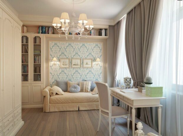
This reading area and workspace are surrounded by more voluminous boho curtains that exude romance and sensuality. The warmth and contrast are wonderful.
7. Taupe Walls for a Subtle Foundation
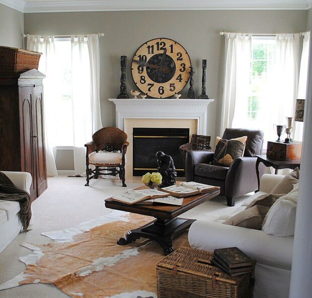
Source: architecturelab.net
This eclectically decorated living area is built on a soft, warm base provided by the taupe walls.
It’s the perfect neutral tone for a range of colors to reflect off because it’s neither too bright nor too dark.
Warm wooden flooring and brass or gold accents look refined and elegant with taupe walls. Darker shades of taupe can also work well as an accent wall.
8. Plush Taupe Curtains
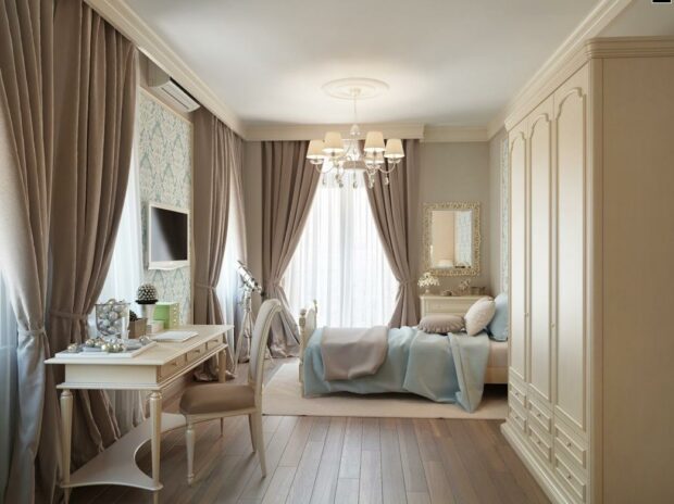
Source: houzz.com
Full, plush taupe curtains nicely highlight this opulent space. This is a stunning example of taupe used in one of the most feminine ways possible.
Unlike other very dark shade curtains, taupe curtains will help a bedroom feel lighter and airier rather than drowning it out.
9. Shades of Taupe
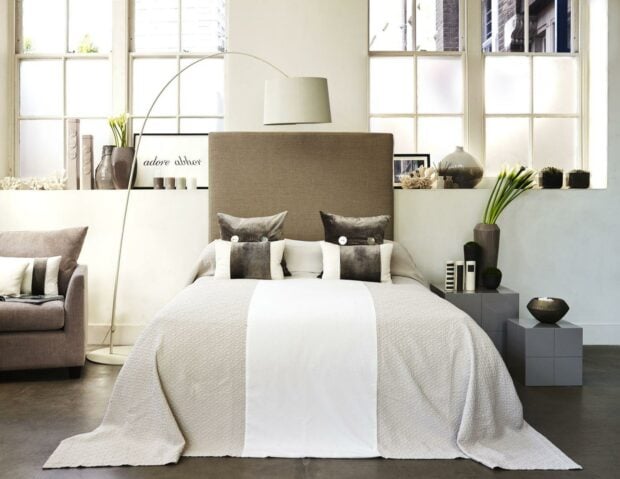
Here is a bedroom demonstrating the various intensities of the perfect shades of taupe. This beautiful, contemporary apartment has everything from light to deep and rich.
As you can see from this taupe bedroom, taupe is one of those colors that isn’t too overpowering to redo an entire room with.
It provides extra texture to any room in your house because the many tones appear as distinct colors.
10. Slight Furniture
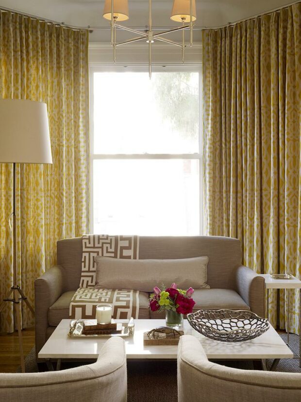
Look at this sofa closely. It blends in well with the rest of this golden, mustard-colored room because of its light taupe covering.
It asks as a strong, richening point to the room and is dazzling.
11. Taupe Undertone
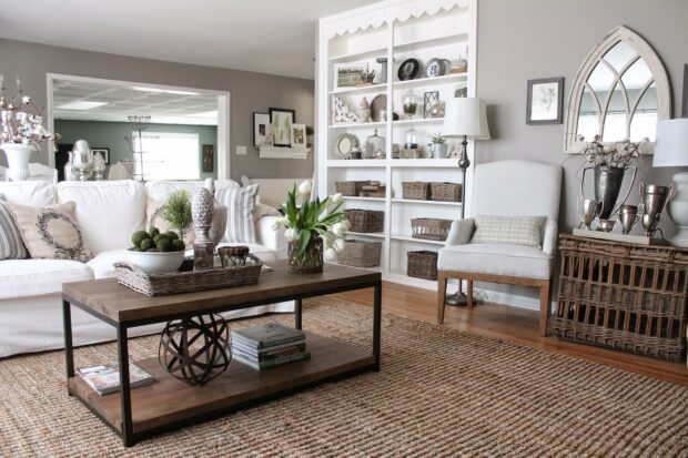
This living room was designed to have a gray atmosphere with a strong taupe undertone, exactly what the space’s developer intended.
You can see how well taupe gets along with a superb gray.
12. Bucolic Comfort
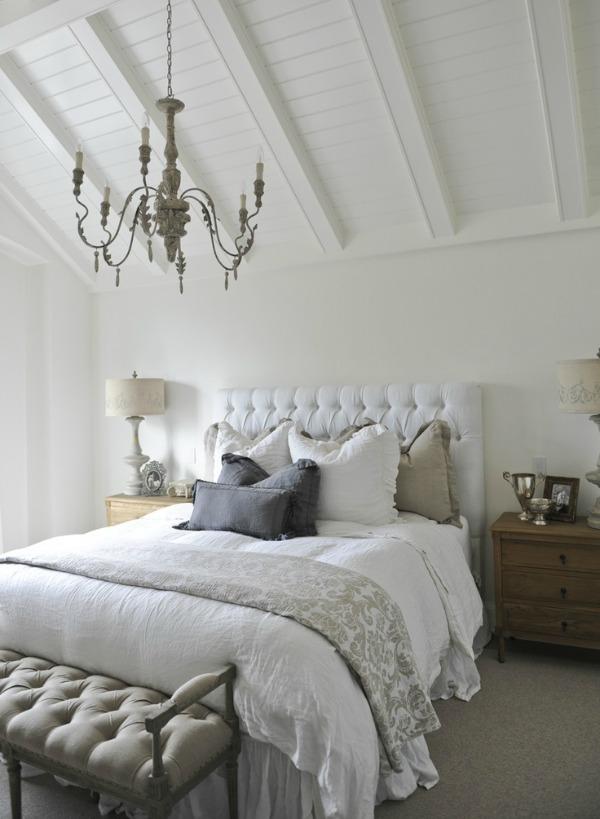
Look at this luxurious, utterly cozy, and lovely bedroom. And we adore the subtle taupe details on the pillows and footstool.
13. Rustic Taupe Bedroom
In this illustration, the taupe fabrics complement the planked wall effectively.
Taupe is a versatile color that can create nearly any style you like to fit with your existing home decor. This would be a good option for your guest or teenagers’ bedrooms.
With taupe, you may add various elements to the space without being concerned about the colors clashing. This is so because the room’s Foundation is a neutral color.
14. Silky Taupe Walls
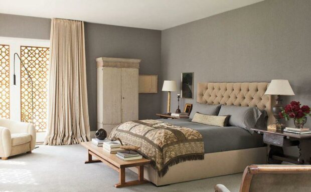
The dark taupe walls create a bold counter to the golden cream neutrals used throughout this bedroom. Although it’s lovely praise, that’s still incredibly soothing.
The drapes and headboard with lighter shades also contribute to the room’s little brightening. This dark shade of taupe is perfect for a bedroom.
As you can see, there are many various shades of taupe, so the key is to hunt for a room and select one that works to create the ambiance you want.
15. Orange Blast Decor
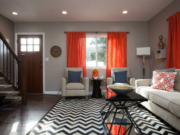
Taupe can also be a good canvas for a flurry of striking prints and hues. The floor’s striped pattern and the mango tint on the windows work well with this subdued, gentle color.
You can always choose a different color or a more subdued orange if this mango color is too intense.
Try a few options before picking the one you like most for your living space because taupe goes well with a few hues.
16. Creative Place
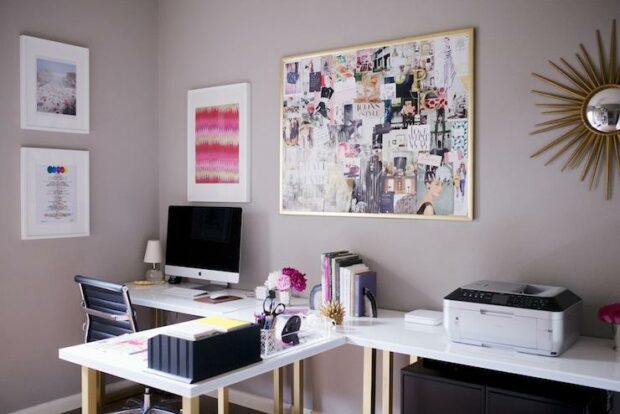
Taupe can set the stage more fascinatingly than stark white or natural gray. Even a home office designed for inspiration can benefit from its attraction.
Taupe can create a more relaxed working environment than a sterile black-and-white office may do because so many individuals nowadays still work from home.
You’ll feel as though you have a place where you can be imaginative and concentrate on your work, a place you’ll enjoy going to every day while you’re at work.
17. Color Bursts
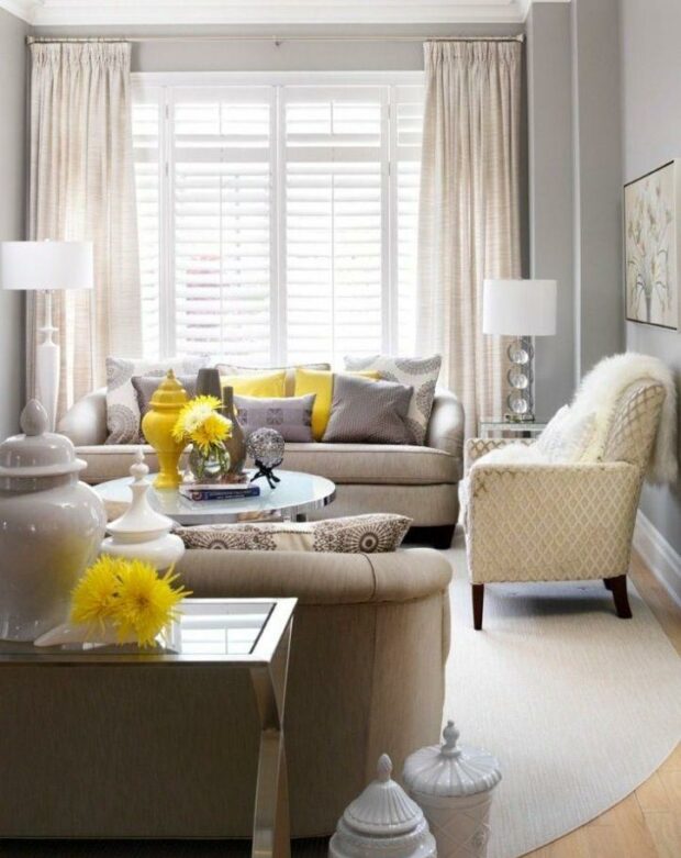
Look around this eye-catching living space. It’s such a pleasant place to spend time at home, with touches of cream and taupe colors and a few vibrant colors (bright yellow accents).
18. Posh Nursery Decor
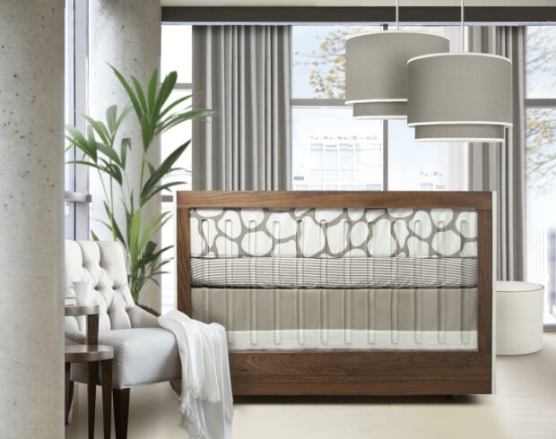
Who would have thought a neutral hue nursery could be so chic and contemporary? When stylized properly, it may be pretty intriguing.
Playing around with gender concepts also has a strong tone.
As your child outgrows their existing Furniture, you can effortlessly convert this sophisticated nursery into a bedroom by changing the decor as necessary.
You can add their favorite color to the background with engaging decorations and furniture with warm colors.
19. Taupe With Plum
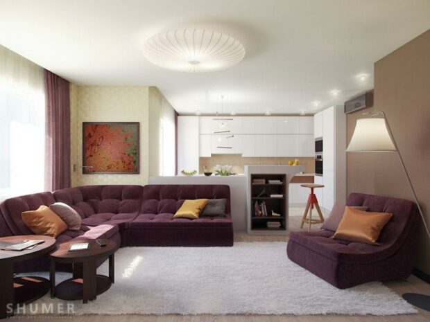
It’s amazing how complementary a pair of taupe shoes can be to a plum counterpart. The taupe colors accent this living room, adding a lovely touch to this sinister area.
Matching this color in your home will be simpler if you discover a taupe shade with a purple undertone. Almost any property can benefit from taupe as a base color.
If you choose to redecorate, you can keep your current furniture by painting the taupe walls and relocating it to its original location.
20. Romantic Sofas Taupe Upholstered
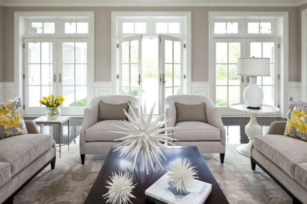
The taupe sofas and accent chairs’ decorative throw pillows give this living room a spooky, seductive feel.
Also, we adore this neutral color combined with the paler and more vibrant cream tone.
Adding taupe colors, complementing traditional and modern homes, would benefit a huge living room.
Taupe gives a warm and inviting appeal that will entice everyone to settle down in your living area and looks excellent on soft furniture like these sofas.
Why Should You Use Shades of Taupe in Your Designs?
Taupe color is more versatile and has an ageless appearance because it is more neutral. The color is modest and perennially fashionable, regardless of the season.
Taupe has qualities in common with gray and brown and can evoke a feeling of serenity, coziness, and sophistication.
Dark taupe gives a sense of closeness and friendliness and shrinks a large room, while pale taupe makes small, gloomy rooms appear lighter and more spacious.
A darker shade might be trustworthy and attractive but can also become depressing. As taupe is considered a more neutral shade, interior designs frequently use it.
Taupe is a popular choice among designers because it makes a stunning backdrop for more vivid hues. Nevertheless, taupe or other neutral colors used in excess can look bland.
What Is the Psychology Behind the Usage of the Taupe Color?
Taupe is considered classic, impartial, useful, fundamental, genuine, organic, and humble. Because this versatile color is not popular, it will never go out of style.
Similar to taupe, these folks value dependability, tradition, and practicality. They avoid being the focus of attention and tend to be very modest.
Taupe lovers blend in with almost everyone; others are drawn to them because of their warmth.
A taupe-lover is rarely one to suggest trying something risky, but they are always down to tag along!
Contrarily, those who adore taupe may be viewed as uninteresting, cautious, and conservative.
Frequently Asked Questions (FAQs)
The most frequent queries regarding the shade of taupe are listed below:
Is Taupe Brownish Gray or Beige?
Usually speaking, beige, which is yellow-brown, is lighter than Taupe, which is a gray-brown shade.
What Color Is Taupe a Shade Of?
Taupe is a versatile color that sits between gray and brown is taupe. It is a mix of black or red with green and yellow undertones.
What Colors Look Good With Taupe?
The classic neutral color works well with almost all hues, making it a fantastic option for a daring interior design.
Taupe pairs beautifully with delicate pastel colors and bold hues like fuchsia, cool lavender, turquoise, and emerald green.
Taupe Color Conclusion
As you can see, the taupe color can be seen in many colors, from brown-gray to dark tan.
Taupe is a terrific base hue to utilize in any room, whether you intend to redesign your bedroom, study, or living room this year.
The color is a fantastic starting point for practically any accent color, which you may add by adding more decorations and furniture to the space.
You’ll find this ideal middle tone simple in contemporary and conventional home renovations if you can’t decide between grey and brown.


