The annual collection of Tiffany and Co. is always a closely followed event, with many vying to get their hands on anything with that coveted Tiffany blue color.
However, as far as colors go, pairing such a unique and custom color can leave many at a loss. From exquisitely handcrafted jewels to painting Tiffany blue walls, this elusive color is a modern icon, to say the least.
Being a versatile hue, it is an excellent shade for interior design. But what are the best colors to complement the official color of such a prestigious brand? Here are the best color combinations to add to your blue book and elevate any space to the next level.

1. White
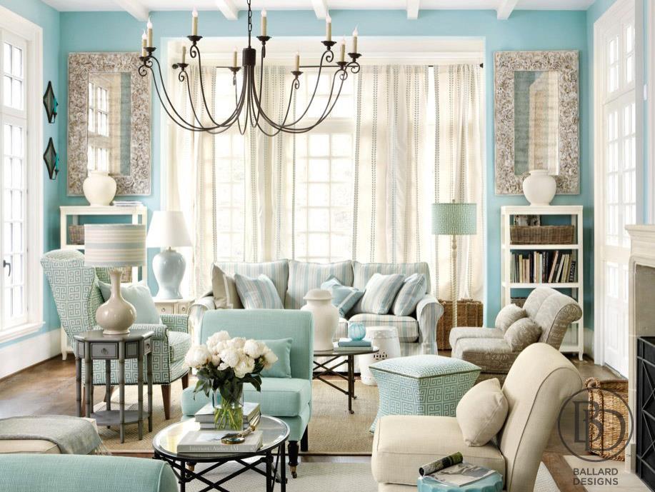
White is one of those colors that can be paired with almost any hue. It is one of the default choices of many, as it does not add or take away anything from the room. As Tiffany blue is such a bright color, the white acts as the canvas to let it shine.
Additionally, aesthetic-wise, the blue color holds an aura of exclusivity and class that is reflected beautifully in the white. If you are unsure of where to start experimenting with this blue palette, white is always a safe choice to start off with.
2. Green
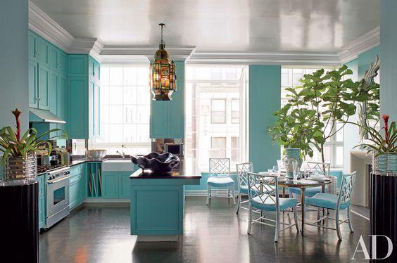
Adding a deep shade of green to offset the vibrant Tiffany blue color is an excellent way to create a lively room. The blue-green tone combination adds an air of luxury to any space. By adding just a hint of different shades of green, it is enough to contrast the bright blue and create texture and variation.
Moreover, a bright green shade can be used to give a more relaxed tone to the room. This combination is perfect for a home office or gym where high energy is crucial. With both these bright colors adorning the walls, it invigorates and gives a burst of energy to improve mood and productivity.
3. Beige
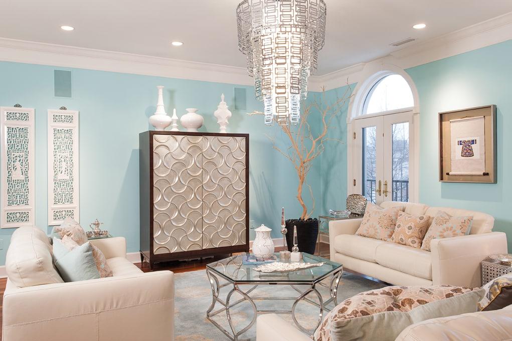
Cream colors are another beautiful shade to compliment Tiffany blue. A beige tone pairs well and enhances the elegance that the blue color holds. And keeping a monochromatic palette helps the cream hues flow together with the blue to create a soft texture on the walls.
By mixing in different shades of cream, the blue shade can become the highlight of the room. This light cream paint is not strictly white, nor is it completely flat, so the eye is drawn to any Tiffany blue accents and pieces. It’s definitely a great option if you want to flaunt the blue hits on the walls!
Source Unknown
4. Turquoise
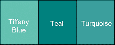
Adding turquoise or aqua to your color wheel is an excellent way to amplify the elegance of the blue shade. Although these shades make an analogous color scheme, they are still different from the blue.
Placing a small hint of teal or aqua paint is a simple way to add variety and break up the bright Tiffany blue. Besides, it’s a subtle way to keep the Tiffany color lowkey. For those in the know, the blue will be noticed, but to the average eye, it is just a collection of vibrant shades of blue.
5. Brown
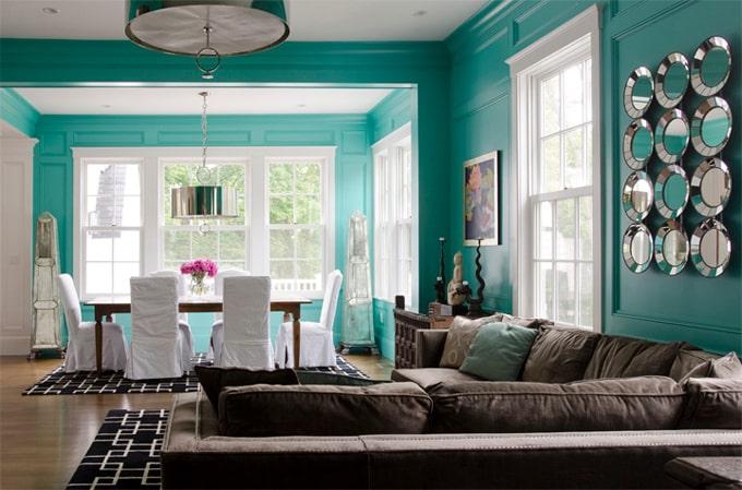
An earthy brown tone is definitely a bold choice to pair with Tiffany blue. However, the dark tones bring the colors back down and balance it out for a cohesive aesthetic. Wooden furniture is a great way to add variety to the color composition of a room without being too distracting.
The blue is meant to be the focal point of the room, so these breaks of brown allow it to stand out even more. For those looking for a rustic look that still has a flair of elegance, brown is definitely worth looking into.
Source Unknown
6. Yellow
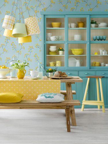
Yellow shades are known for their implications in the feng shui of a room. Having Tiffany blue is even more reason to pair these two together to make an environment that is peaceful and relaxing. As yellow is such a vibrant color already, it shouldn’t be applied all over the walls as it can easily overpower the softer blue hues.
A recommended application of yellow with Tiffany blue is using the yellow to act as accents scattered throughout the room. By keeping the blue as the highlight, the yellow hits only serve to draw the eye toward the Tiffany pieces.
7. Red
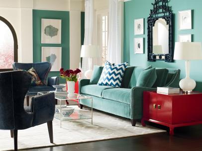
Red is a complementary color that contrasts nicely against the iconic Tiffany blue. Whether it is a deep wine or a coral hue, it is safe to say that red brings out the best of the blues. Red and blue are considered opposites on a wheel, so putting clashing elements together can be challenging to pull off.
In order to make sure the blue doesn’t stand out too much, keep the red balanced in small areas and pieces. Using it in accents is an easy way to add pops of color that break up the blue without clashing too much.
8. Pink
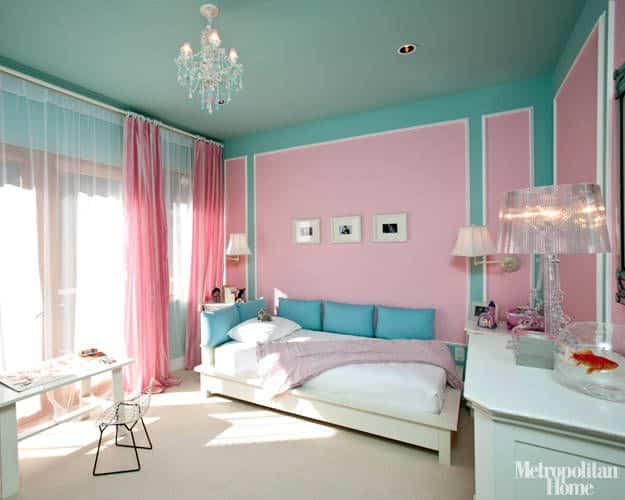
Admittedly, pink may not be the first obvious choice when it comes to complementing Tiffany blue; however, it is still possible. The key is looking for a coral pink that is close in composition to the blue color. By using a toned-down hue of pink, the color combination inexplicably works and is pleasing to look at.
On the color palette, blue and pink are quite close to each other, meaning they mesh and flow together nicely. If anything, this combination is ideal for those who are looking for a specific aesthetic that is just as unique as Tiffany blue. Don’t let the bright composition deter you from exploring the vast range of pinks available; you may just find the right shade to bring out the best in the blues.
Hopefully, interior design is more approachable with this wide spectrum of options to pair with Tiffany Blue at your disposal. Whether it is for the living room or the kitchen, any room sporting such a prestigious shade is worthy of that extra bit of attention.
Take the time to experiment and see which shades look best for you, depending on what aesthetic you are going for. Remember that taste is subjective, so if you are feeling adventurous, then don’t hesitate to go for it!
Have fun putting together your own color wheel, and enjoy creating a treat for the eyes with your beautiful Tiffany blue!
Related Links
What Color Goes With Chocolate Brown
What Color Goes With Navy Blue And White
What Color Goes With Purple And Green
What Color Goes With Black And Gold
Hard Hat Color Codes & Their Meanings
What Color is Mikado and How You Can Use It in Your Home Décor
What Color is Teal and How You Can Use It in Your Home Décor
How to Use Lavender Color to Your Advantage in Home Décor
Colors That Go With Gray and How to Decorate With Gray
What Chartreuse Color Is and How to Use It in Home Décor Splendidly


