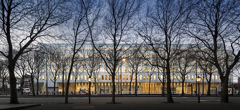
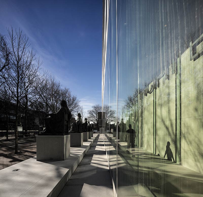
The new building of the Supreme Court of the Netherlands by KAAN Architecten has been decidedly integrated into the elegant historic city centre of The Hague. The building, which houses a staff of 350, verges on large: 104 metres long, 22 metres deep and 27 metres tall. These dimensions, with the measured vibrancy of its facades, add some allure to this part of the city centre. The plane trees and six legal scholars in bronze seated on pedestals make for a wide gateway on the Korte Voorhout, a royal route leading to the buildings from Parliament. The entrance hall seems to have been chiseled from a solid block of marble. It serves as a sturdy base for the superstructure of glass panels and slender latticework. These and other ostensible contradictions seem to reflect the work of the Supreme Court itself. Open and closed, distinguished and functional, hard and ethereal, rough and refined – all exist alongside routine business, on which judgements are passed with great clarity of mind.
A court building is by definition a complex structure, because it must have various routes of circulation that cannot intersect. Routes for the public sitting in on sessions, for the Council and Procurator General staff, and for the detainees escorted for their sessions in court; all are separate from one another. The staff have their own entrance that opens onto their workspace. The justices have their own way to the courtrooms. Even the dossiers have their own route. It is a mark of achievement that a solution was designed that allowed all the routing to seem completely natural.
Given the public nature of jurisdiction, court buildings need to be accessible to the public. They are not only open to the public, they also have facilities for the public, visitors galleries in the courtrooms and waiting areas in front of them. On the other hand, court premises must also provide excellent conditions for work that requires a high degree of concentration and work that takes place behind closed doors.
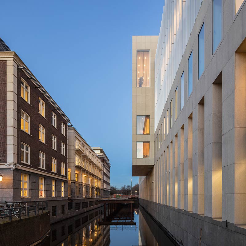
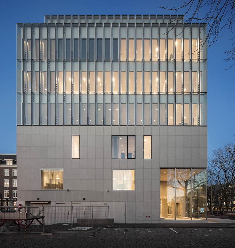
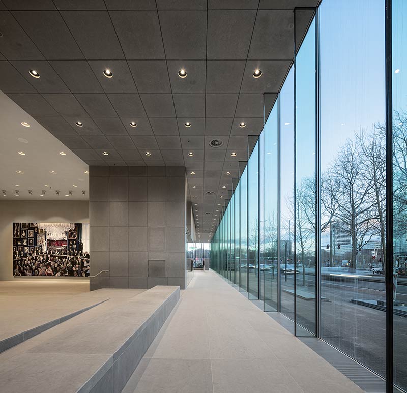
The positioning of the building in regard to its location was chosen resolutely and with care. The low plateau with its row of scholars creates a subtle transition. Through this zone the building attaches itself to the street and its breadth is moderated. The way in which the top line has been sutured ensures a soft presence and inclusiveness within the orderly roofscape of this part of the city. Larger-scale urban design is successfully achieved by way of smaller-scale architectural choices. The so-called ‘backpack’ is also an example of subtle insertion. This extension at the building’s back reaches out and connects with the surroundings. The glazing fits into the same story. The six-metre high windows on the ground floor pull the space of the entrance hall into the city.
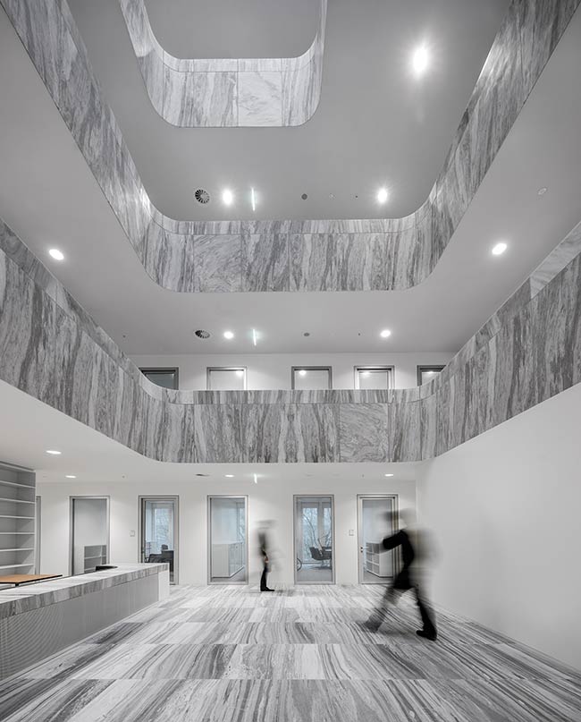
The entrance hall of the Supreme Court with courtrooms and the press area form the public area, a space double the floor height covering the full length of the building. The street zone of Korte Voorhout seems to flow through the six-metre tall glazing into the entrance hall. The floor of the hall has a geometric pattern in low-relief and is a landscape of sitting opportunities, dotted with loose, dark brown leather cushions, which meant that couches and chairs were unnecessary. The floors and walls are of a light grey limestone that exudes a velvety sensation.
The large courtroom with public seating for around 400 visitors and the small courtroom for around 80 visitors have floors, wainscotting and an oak wood bench. The walls behind the justices in both courtrooms, which the public face, are of brown veined translucent alabaster.
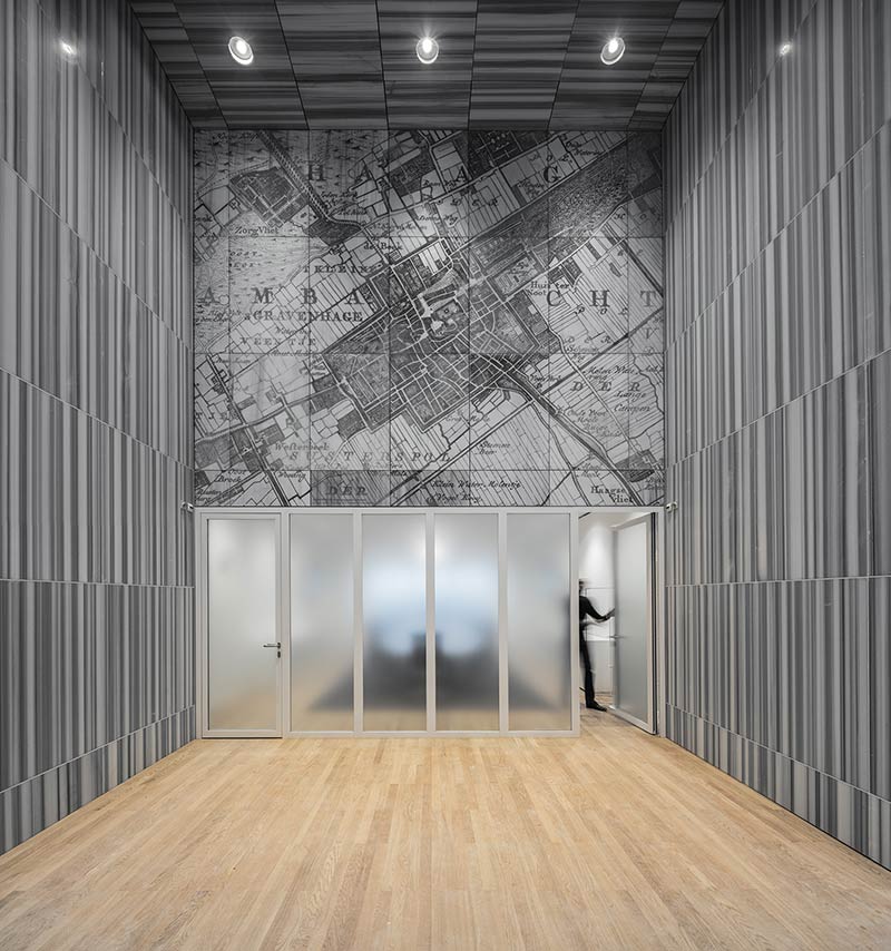
In the middle of the entrance hall, on the wall of the square inner courtyard between the two courtrooms, is a surprising painting by Helen Verhoeven commissioned for the spot. At 4 by 6½ metres, this monumental work is quite a bit bigger than Rembrandt’s Nightwatch in the Rijksmuseum. Titled Hoge Raad, the populous painting gives an impression of the history of the Netherlands as a society and state, and the place of the Supreme Court within this. The paintings represented within the painting refer to the consequences when orderly justice is absent. This touches on the Supreme Court’s motto, words penned by Dutch legal scholar Hugo de Groot (1583-1645), founder of international law and maritime law: UBI IUDICIA DEFICIUNT INCIPIT BELLUM. Loosely translated the motto says: where legal justice falls short, armed struggle begins.
The windows on the floors above are of unified glazing, in panels of 90 centimetres with 10 centimetre joints, stretching the full height of the upper façade. There is an even division of vertical planes over the whole facade and the slender columns per window disappear in the radical rhythms of the frontage. From outside the facade seems to have no supporting columns. The entire concept is grounded in a single design detail.
All workspaces have regal ceiling heights of at least 3 metres. Usually in office buildings spent air is pumped away through air pipes that take up a lot of room in ceilings. In the Supreme Court building the jambs of the door frames evacuate this air from the rooms to the open areas and ventilators above these transport the spent air out. A labyrinthine construction in the frames prevents sound leakage between workrooms and hallways.
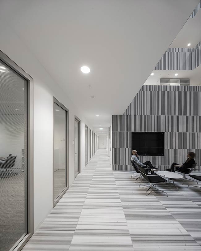
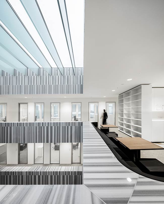
Daylight in the heart of the building is very important, but the light wells and open atriums serve another important purpose for the building’s users. They form the core of the distinct domains of the Council and Procurator General. At the circumference of the openings each floor has pantries with coffee machines, seating and bookcases. The various departments are forged into unity around the central points of the building. The light, the sightlines across and up and down, and the open perspectives stimulate greetings and encounters, encourage an exchange of thoughts and opinions, advance the sharing of insights, and allow for informal relations in an infectious working environment. The balustrades around the opening are clad, on the open sides, with vertically striped marble. The series of balustrades one above the other, the stone flooring and the beautiful natural light recall the interiors of the historic townhouses found on Lange Voorhout or the Vijverberg. They also have associations with longevity and respectability.
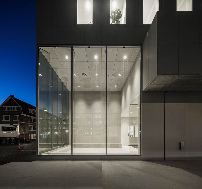
Three sides of the building are exposed to sun over the course of a day. These facades are climate controlled through the use of a spacious cavity in the glass casings: glass boxes that not only keep out the heat and cold, but also the sound of traffic outside. Nonetheless, the windows can be opened if desired, while still keeping wind and noise out of the interior. Sun blinds and light filters can also be individually regulated – the sun blinds are behind the first window and the light filters are behind the second. This individually controlled double protection produces a layered facade, flat and yet canted, a subtle nuance that adds even more elegance to the whole.
Project Details:
Location: Korte Voorhout 8, The Hague, The Netherlands
Site area: 2,500 sqm
Total floor area: 18,000 sqm
Client: Rijksvastgoedbedrijf
Architects: KAAN Architecten
Design team: Allard Assies, Luca Baialardo, Christophe Banderier, Bas Barendse, Dennis Bruijn, Timo Cardol, Sebastian van Damme, Marten Dashorst, Luuk Dietz, Willemijn van Donselaar, Paolo Faleschini, Raluca Firicel, Michael Geensen, Cristina Gonzalo Cuairán, Joost Harteveld, Walter Hoogerwerf, Michiel van der Horst, Marlon Jonkers, Jan Teunis ten Kate, Marco Lanna, Giuseppe Mazzaglia, Ana Rivero Esteban, Joeri Spijkers, Koen van Tienen, Noëmi Vos
Photographs: Fernando Guerra | FG+SG


