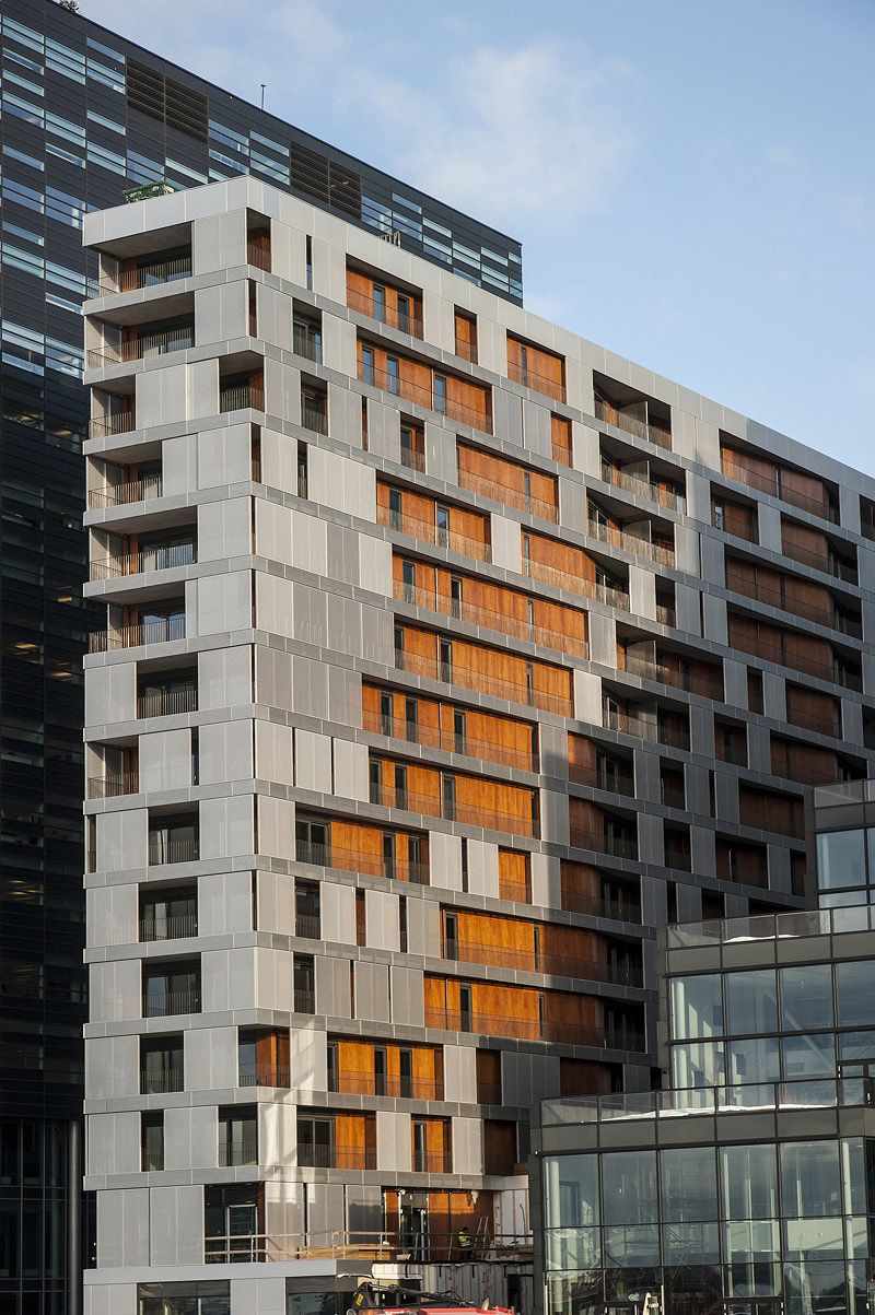
The Opera Quarter is a central district in Oslo. The area is situated between the tracks of Oslo Central Station and Dronning Eufemias gate; a new avenue that will tie east and west together. Consisting of 12 buildings, the Opera Quarter will house 10 000 seats for work personnel, and 500 apartment units. All buildings are designed in accordance to the Barcode principal: long slender, high rise volumes with sightlines in between.
Site plan:
The master plan developed for the Opera Quarter is a result of an international competition held in 2003, where the Barcode concept by MVRDV, A-lab and DARK Arkitekter was selected. Demands were set for the volumes to stretch the full length of the site, have rectangular forms and hold uniform material expressions. The building blocks come down to form an exterior grid of public passages. At street level, program organization aims to work with the overall intentions for urban life and public interaction, as shops, service and offices gives something back to the city. Asking for an exceptional outcome is the site segment occupied by MAD’s residential building: less than 30 meters wide and flanked by high-rise office buildings with dark façade appearances. Daylight coverage from Southeast is secured, however, by the stepped volume of the neighboring building east from the apartments. Regulations specify demands related to the distance between apartment windows and neighboring buildings, and set the parameters for the extreme proportions executed in the project.

The Apartments:
Born from this unique outset, the MAD-building is possibly one of the world’s most slender apartment blocks. Measurements of this 15 floor construction are 7,8 x 90 meters, and at its leanest point, width is shrunk to an astonishing 6 meters! These high-standard urban apartments offer exposure to daylight and connectivity to its context like few others. Designed in a finely tuned manner, conducted by high demands for quality and driven by its regulations, the MAD-building responds to the Barcode concept in a thorough manner.
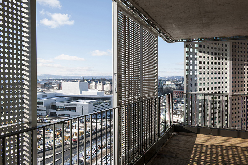
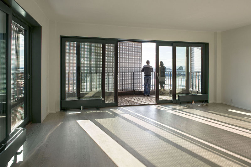
On a standard floor, there are six apartments of various sizes and shapes. Each apartment is provided a separate balcony, supplemented with the generous common gardens at roof level. All units have their living rooms and balconies facing Southeast, and the neighbouring buildings’ geometry allow sunlight to enter all day. Large sliding glass doors give a close connection between inside and outside. Along the less sun-exposed Northeastern façade, bathrooms and bedrooms are situated. A ceiling height of 2,7 meters is standard within all apartments.
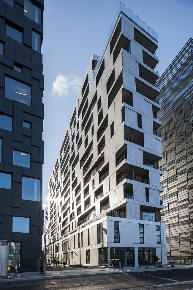
Zig-zaging exterior walls within the outer aluminium leaf are tailored to balance the individual apartments’ needs. Variations of deeper balcony areas that emerge into slender French balconies in their stretch towards the circulation cores offer effective balance in the interior/exterior space utilization. Circulation cores are situated behind the outer corners in this zigzag wall; consequently, lateral stability is secured in the full width of the construction. Last but not least, the angular variations ensure a wider spectre of view, addressing more than the tall rise neighbors.
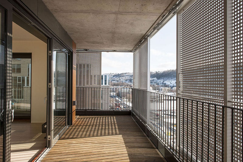
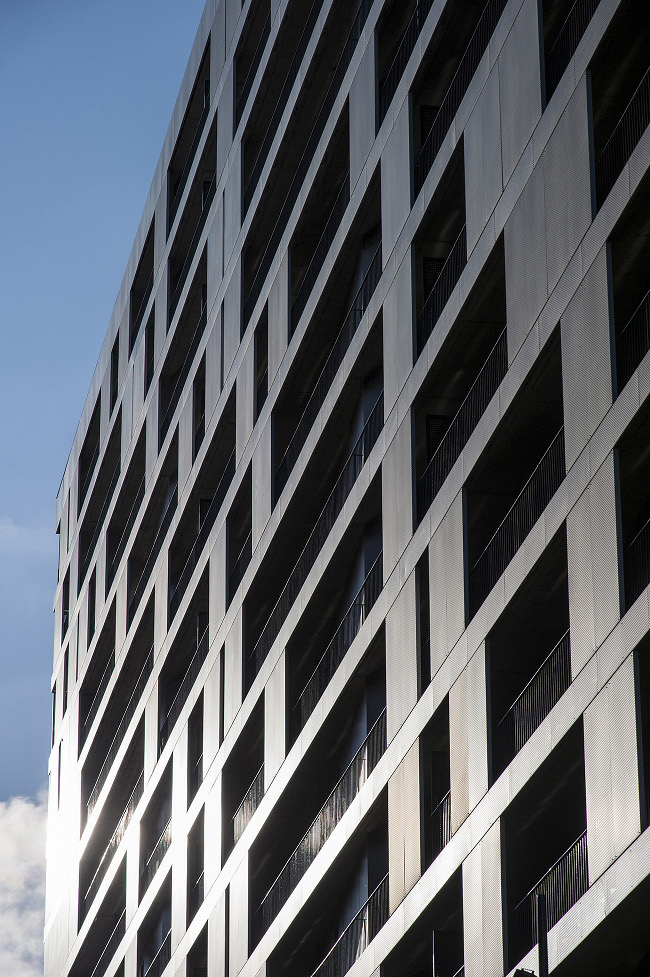
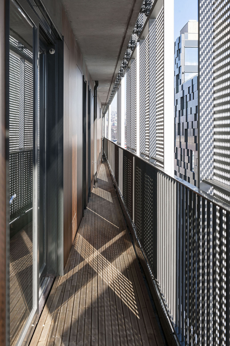
The outer skin of anodized, perforated aluminium, defines the rectangular Barcode body. Custom designed movable façade elements allow the occupants to control to which extent their apartment is exposed to sunlight and public surroundings. Along with being a valuable feature for residents in a densely populated district, this living façade that keep changing is architecturally exciting. Perforations are designed in a careful manner to allow views from inside the apartments, while still giving the expression of being uniform surfaces to exterior surroundings. Light filtered in interesting patterns on the organic inner skin of warm timber cladding assure a lively atmosphere within this sober envelop. At night, lights at the balconies leak through the perforation, making the envelope glow. The dialogue between these two skins, and their contrasts, are among the project’s most characteristic features.
Commercial Areas:
Connecting the MAD-building to its context, floor 1 and 2 are assigned to gym facilities, business, offices and dining. As regulation sets different parameters for commercial areas within Barcode, this base slab is allowed to be extended in Southeast direction. In a base that aim to interact with urban surroundings, the public will have the opportunity to run on treadmills while overlooking the trains passing by, or enjoying a meal on the sunny terrace of the two-storey restaurant facing Dronning Eufemias gate.
Flanking Passages:
Thematised outdoor areas designed by MAD flank the building. At the Southeast entrance side, a strip inspired by Norwegian nature has the ambition of working as a buffer between private residence and the city. It is designed to function as a passage, rather than a space to reside. A continuous urban surface is broken up by fields of forest flowers, small conifers, heather and moss, that will contribute to a distinct Norwegian character. These are hardy species that will adapt to the seasons and bring a rural experience to this district of concrete, steel and glass. At spring, a carpet of anemone flowers; in autumn, blueberry bushes and sparkling colours; and in the winter, covered in snow. Artificial lighting will enhance the various characters, and effect lights at the urban surface will complete the experience.
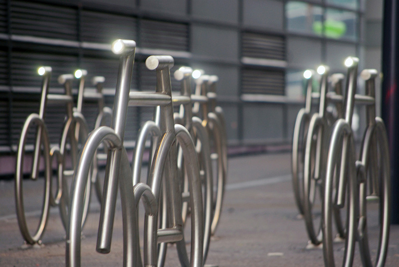
The Northwestern strip is thematised as a cycling peloton. This area was a challenge: how does one create something interesting from a 10×90 meter passage with little sun exposure, with a demand of more than 200 bike racks – a passage that will also work as the main entrance to interior commercial areas. MAD’s simple, but genius solution was to create bike racks so beautiful that people more than willingly would walk a detour just to look at them! Custom designed ‘bikes’ in stainless steel offer secure bike storage, along with a visually and spatially interesting expression. Each steel bike has LED-lights employed; white facing the fjord, and red facing the city.
Outdoor areas:
Residents of the apartments are offered great outdoor opportunities to sit back on a sunny day, enjoy rich views, or assemble social gatherings. Private balconies and shared roof terraces hold various qualities:
At the 2nd floor, one can enter a shared roof terrace directly from the stair case. A sun exposed and wind sheltered space with large flower containers. The apartments at the 2nd floor have additional large private roof terraces secluded from the public ones.
At the 13th floor, a large Northeast-facing shared roof terrace is employed, as regulation demanded the building to be lower at this point. Afternoon sun and a tall glass railing give good premises to enjoy the city view.
At the 15th floor, the largest roof terrace is situated, offering spectacular views over both city and fjord. A zoned characteristic by fixed furniture and flower containers suggests different degrees of privacy and activity.
Project Details:
Location: Dronning Eufemias gate 18-26, Oslo, Norway
Type: Residential
Date of Completion: 2013
Architects: MAD Arkitekter (www.mad.no / www.facebook.com/madark )
Developer: Oslo S Utvikling AS
Project Management: Vedal Prosjekt AS
Landscape Architect: Grindaker AS
Structural Engineer/Acoustic Consultant: Multiconsult AS
Thermal Consultant: Erichsen og Horgen AS
Electrical Consultant: ECT AS
Photo credits: Jiri Havran and Kurt Singstad


