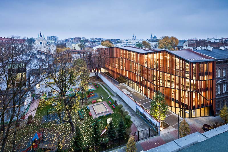
The Małopolska Garden of Arts is a cross between two institutions: the Juliusz Słowacki Theatre and the Małopolska Voivodeship Library. This was aimed to be a functional extension of the both institutions, while at the same time it was to bestow a new dimension upon them. It was about a completely new type of cultural facility, not only collecting multimedia, transferring collections of music, radio, TV and film recordings onto new media, but also a space for performances, film screenings and concerts.
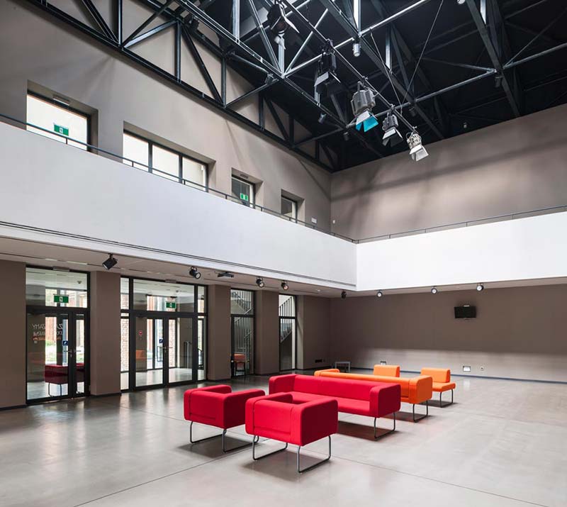
The wing on Szujskiego Street holds a modern art and media library, with multimedia books and music, while the section standing on Rajska Street has been developed by the theatre, and is equipped with a multifunctional hall. The hall – operating as a studio theatre, conference room, concert hall, and venue for banquets and exhibitions – holds two retractable stages for 300 people.
State-of-the-art stage technology is present overhead: fixed on hoists and cranes to the steel ceiling girders. This allows dramas and concerts to be performed, and exhibitions, film screenings, symposiums, conferences, art auctions, fashion shows, and many more events to be held. Altogether, the space of about 4300 sq.m houses a theatre together with a cosy cinema with 98 seats, a café, and premises for the organisation of educational, art-related activities.
New Public spaces / Art Gardens:
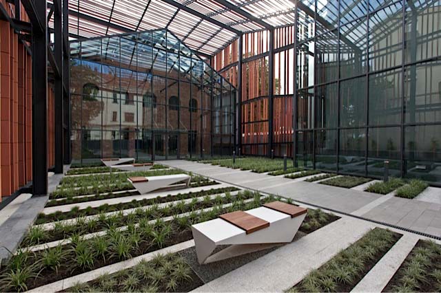
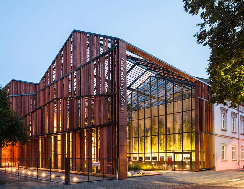
Honing the form, the architects focused on creation of two open public spaces in front of the entrances and its interaction with the future recipients. The spaces introduced a new small scale urban “pocket gardens” for the visitors and local community. The spatial form of the openwork ceramic roofing raised over the garden from the side of Rajska Street – though not functioning as an actual roof – is there to create an atmosphere of an outside foyer marked with the symbolic form of an entrance gateway to the stage.
In this way, the building delicately nudges passers-by with the skilful manipulation of the form, already at first glance giving the onlooker the impression of going beyond the borders of a garden, where culture is grown in evenly planted rows. Further proof of the sophisticated play with the space is the garden itself. Imitating flower beds, the equal bands with low greens are a metaphor of a garden: as much as the architects could afford here. A notable fact is that historically “ulica Rajska” – literally “Paradise Street” – led to the Garden of Paradise.
Design strategy : Interpreting history / Creating a contemporary sign:
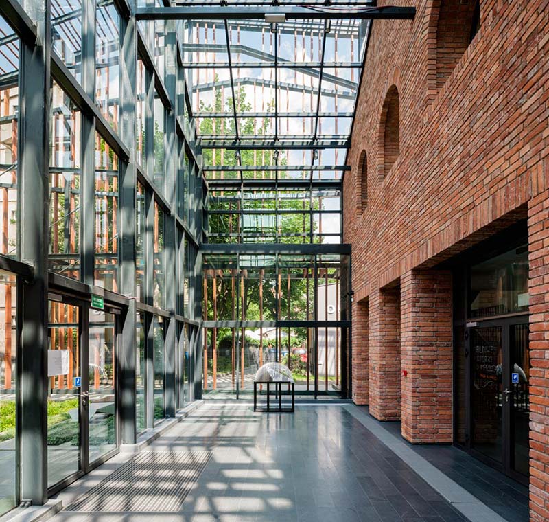
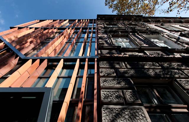
The main idea of the architects was to develop contextual design strategy to achieve an individual form with a modern expression of its own, but at the same time not obscuring the character of the place. The form of the building is a result of an attempt to create a strong contemporary sign within the historical context, a design strategy spanned between “mimesis and abstraction”. It draws inspiration from the code of contextual forms by making references to the geometry of the roofs and tissue (brick) of the neighbouring structures applied for the abstract geometrical compositions of the ceramic façades.
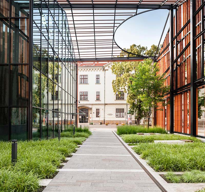
The building fits the scale of its environment perfectly by maintaining the lines of the roof and divisions of the façades in line with the composition and linear solutions of the neighbouring buildings. On the one hand it respects the morphological continuity by using signs based on iconic representations – in other words a geometrical code, as well as a comparable scale of neighbouring structures. On the other hand, one abstracts from the context and interprets it. The historical forms and materials, in this case forms of the roofs and the geometrical composition of facades and such materials as brick and steel, have been analysed and processed to achieve the new, contemporary form and expression.
The formal aspects of the work
The neighbourhood is defined by the style of 19th and 20th century, mostly residential buildings, surrounding the medieval centre of Kraków. Most buildings have eclectic facades, with articulated cornices and divisions between the storeys; roof ridges are parallel to the street line. The elevations are finished with plaster and brick. The project is carried out on the site of a 19th century hall with brick walls and steel roof structure – which originally served as a horse riding school and later as technical facilities of the Słowacki Theatre – housing the theatre’s workshops and occasionally also serving as a rehearsal stage. Parts of the old walls are incorporated into the new structure.
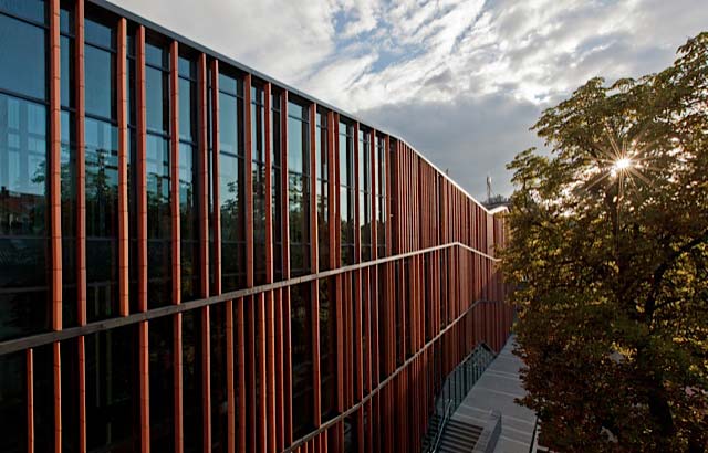
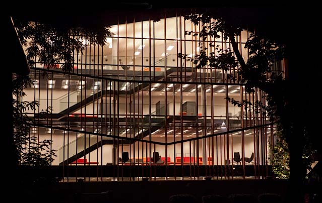
The newly designed building is of variable height, but it does not exceed the scale of the former horse riding school and the neighbouring buildings. The line of the cornice is at an angle, which refers by its form to the scale and inclination of roofs of the houses nearby. The idea is to aim at adjusting the new form to the type and character of existing structures. The divisions of the new building facade also relate to those of neighbouring buildings (cornices), although the façade strays from any classicist systems, and is a continuous and open composition of bands of glass with a screening vertical system of elevation elements from ceramic moulds, in the range of colours of traditionally burnt brick.
The structure – systems and materials
Structural system of the building within the complex is a multi-part and non-uniform one. Its form is influenced at first by the hydrogeological conditions and direct neighbourhood of buildings constructed at the turn of 19th and 20th century. The most serious problem was to set the floor level of the basement much below the groundwater table. The underground floor level is set ca. 3,5 m under water. The structure was designed in such a way so the foundation conditions of neighbouring buildings remained unchanged. System of slurry walls was used – they were deepened down to the level of impermeable soil layers – tertiary clays lying as deep as 31 m. Underground part of the building is constructed as a monolithic block – without expansion joints despite considerable differences in load values.
Above the 0 level, the structure of mediathèque was designed as a reinforced concrete mixed membrane-column-slab system. The structure of multi-functional hall consists of reinforced-concrete longitudinal and transverse walls – reconstructing the horse riding school that was once located in this place. Its roofing was planned as a steel structure consisting of transverse girders supported by longitudinal walls. Structure of the roof bears also the system of scene equipment elements as well as ventilation devices together with fittings and technological platforms. Elevations in form of ceramic and glass open-work were supported on steel structure of pergola and on the reinforced concrete structure of the mediathèque building.
The structure – systems and materials
The MGA building consists two major functional zones: the mediathèque and the multifunctional hall. The HVAC installation has been separated into two circuits, following with functional layout in order to minimize the costs of operation. The installations mentioned above cover: a multifunctional hall, a bookstore, a mediathèque, a cafe, conference rooms and a cinema. Installations work with variable amount of external air – the ratio of fresh air and recirculation air is being altered depending on the outside temperature and an amount of external air required by people present in the room, which is controlled by CO2 sensors. Fan motors are equipped with inverters, which allow controlling the airflow. In summer and winter seasons – to accrue energy savings – rooms are supplied with the minimum required quantity of external air according to hygienic standards. During the transition period during both seasons, when cool air can be used to chill interior space, up to 100% of exterior air can be used for this purpose.
Additional energy savings, relating to heating and cooling of external air, are provided by rotary heat recovery exchangers installed in the air-handling units. In order to provide the proper sound comfort, the installations have been equipped with attenuators and the air is distributed by ventilation ducts, which are made from damping plates with high sound absorption coefficients.
Project Details:
Location: Krakow, Poland
Area: 4,330.76 sqm
Architects: Ingarden & Ewý Architects (IEA)
Project Team: Piotr Urbanowicz, Sebastian Machaj, Agata Staniucha, Jakub Wagner, Piotr Hojda, Bartosz Haduch, Bogdan Blady, Maciej Szromik, Anna Kula, Sylwia Gowin, Marta Brańska, Piotr Kita, Krzysztof Stępniak
Photographs: Krzysztof Ingarden


