At the dawn of a new era of neo-liberalism in Europe, social housing is once again regarded with increasing indifference. The implicit assumption is that apartments for the lower social classes ought to be small, cramped, dark, badly built and ugly.
Architecture in the sense of a building art hardly plays a role here, for marketing and spatial qualities are regarded as unimportant and superfluous.
Furthermore, social housing developments are facing great financial pressures due to a tightening of environmental laws, which entails a considerable increase in costs for technical equipment and building components, and negatively affects design opportunities.
International star-architects barely show any interest in the topic. Accordingly, very few alternatives (to standard solutions) are being produced which, by becoming showcases, could act as catalysts to break out of the recent stasis.
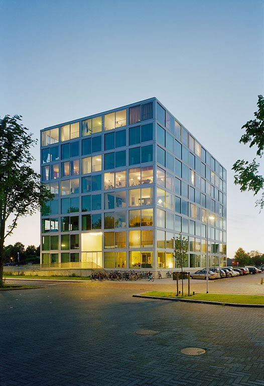
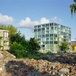
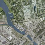
The Hiphouse project in Zwolle presented Atelier Kempe Thill with a welcome opportunity to fundamentally question the assignment ‘social housing’. Largely due to the client’s ambition and the active support of urban planners, a prototypical project could be realized without exceeding a typical Dutch standard budget for comparable projects. A radical minimization of architectural means and a visible assertion of the processes and technologies of the building process helped to realize a maximum of living quality.
Glass Tower Centralized Typology: An Alternative to the Deck-Access Typology
The deck-access typology is the most common form of multi-story social housing in the Netherlands, because a large number of apartments can be connected to a limited number of stairwells. Despite the social stigma this typology has come to represent, it remains an almost inevitable solution. Due to its extreme cost-efficiency it is still being employed today in large numbers. The very compact building typology realized through the central circulation in Zwolle offers an economic and competitive alternative.
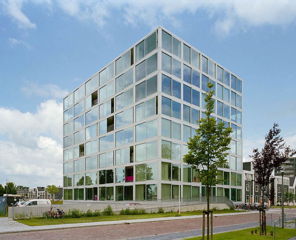
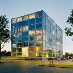
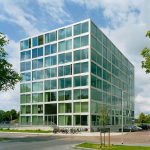
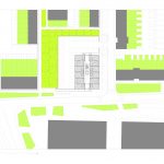
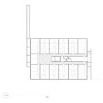
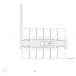
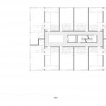
The building block, measuring 23m x 32m and providing 8 units per floor, has a very limited facade surface in relation to its floor area; this favourably affects building costs and enables the high quality detailing of the facade. The housing units are organized around a central core containing a double stair and an elevator. The plan layout allocates the larger apartments to the spatially interesting corners, thus creating apartments with double orientation.
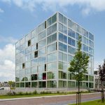
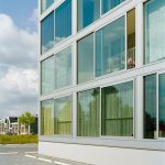
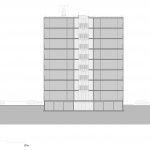
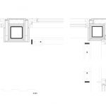
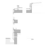
The smaller studio apartments either face east or west, guaranteeing optimum sunlight for all apartments. To compensate for its volumetric compactness, the building’s surface is consistently glazed. Anodized aluminium profiles hold the high quality solar-protection glazing to form the facade. Depending on the viewer’s position the building appears to be covered by a transparent skin or a reflective surface; furthermore, sliding doors provide generously dimensioned facade openings.
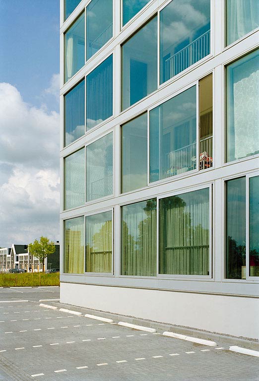
As a whole, a very delicate visual balance is achieved. The functional grid of the windows and the underlying construction form a rigid architectural order, which is counterbalanced by a spontaneous collage of colourful apartment interiors. In a display of the complexities of city life a vital and optimistic image emerges, striking up intensive communication with the neighbourhood. This image is collective as well as individual, for it is – consciously or unconsciously – formed with the active participation of every inhabitant. The ‘building in use’ therefore essentially becomes the facade.
Circulation as Collective Space: The Atrium
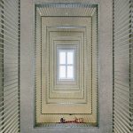
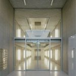
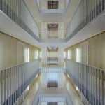
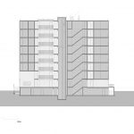
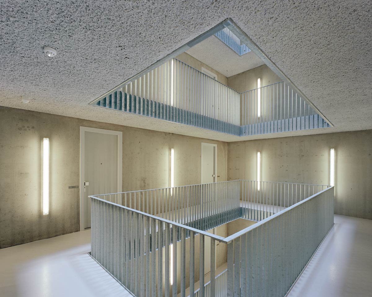
The arrangement of apartments along the volume’s perimeter creates the opportunity to insert a central atrium at no additional cost. A 5.4m high entrance hall gives access to this space, which measures a vertical 26m and is illuminated by a skylight. At the core of the building, the atrium lends an unexpected spatial generosity, which stands in surprising contrast to the external appearance.

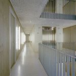
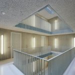
Due to the limited budget the central atrium was coherently designed in the rugged aesthetics of the unfinished. The concrete walls remain unfinished, the floor slabs receive a coating of acoustic plaster, handrails are merely galvanized and simple industrial light fittings are mounted directly onto the walls. As a result, a complex spatial entity emerges, deliberately displaying, but also celebrating, the ‘new poverty’ of contemporary building.
By its generosity the circulation space becomes an area for social interaction between inhabitants and adequately expresses the collective of an expedient alliance of tenants.
Panorama and Light: The Emancipation of Social Housing
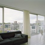
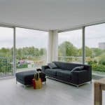
Upon entering the apartments it becomes evident that even in social housing real luxury should be indispensable. The units are very well lit, with minimal circulation areas and large living spaces with freestanding kitchen blocks. Loft spaces are not an exclusive form of living reserved for a well-to-do elite, but are also realizable in the context of social housing. An emancipation of the lower income classes will last but not least have to be achieved through an increase in the quality of individual housing.
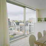
The floor-to-ceiling windows give the apartments a feel of suspended landscape plateaus; the natural environment becomes a part of the space and expands the interior beyond its physical boundaries. Rain, sun, clouds, wind and greenery determine the atmosphere of the interior.
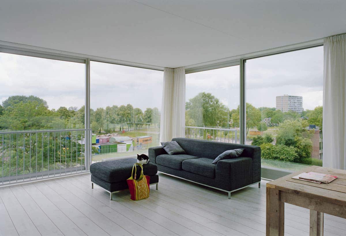
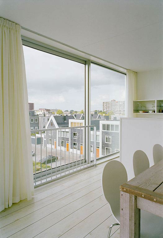
This effect is amplified when the large doors are slid open, transforming the rooms into airy terraces. Gone is the feeling of constriction prevalent in traditional social housing. A maximum of spatial richness is possible with a minimum of means. It therefore doesn’t come as a surprise when a tenant says: ‘Never have I seen such beautiful sunsets as I do from my apartment.” It merely seems like a logical result of a rigorous conception of the apartment as architectural space.
Project Details:
Location: Zwolle, The Netherlands
Type: Residential – Housing
Site Area: 2.500m2
Building Size: 6.399m2 (gross)
Architects: Atelier Kempe Thill architects and planners
Photographs: Ulrich Schwarz – www.architektur-fotografie.net

