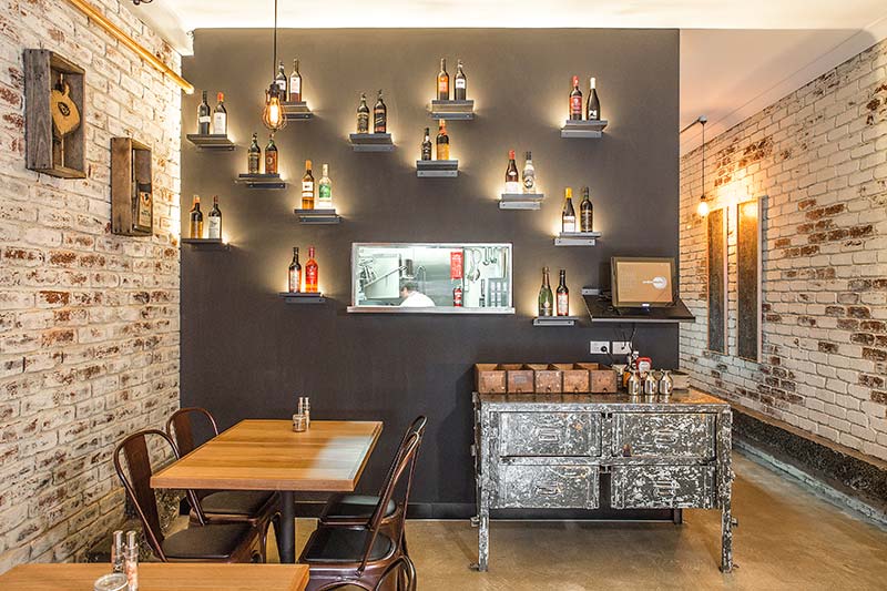
Project Details:
Location: Victoria, Australia
Type: Interiors
Architect: Kalliopi Vakras Architects
Photographs: John Karasavidis
Chato is a small and intimate Spanish Tapas Restaurant and bar experience whose name means, “small glasses of wine” in Spanish and is inspired by the street bars of Madrid, Spain. Attention to detail in design of space and food enriches the patrons experience of the space.
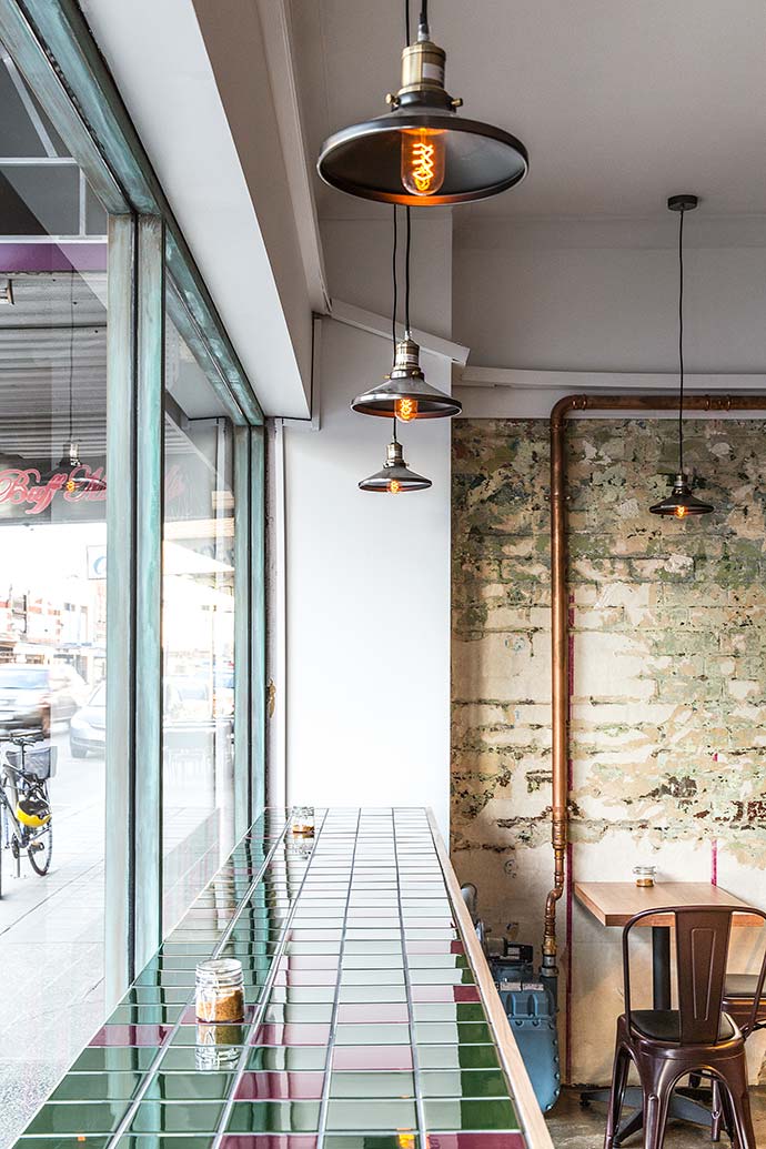
Kalliopi Vakras Architects’ aim was to create an inviting down to earth experience that couples with the menu on offer where customers have a glimpse into the Spanish world of the client’s background. The design plays on the idea of traditional small and intimate Spanish bars with their rustic timber framed doorways and windows to the street, as well as coloured tiles common in Spain.
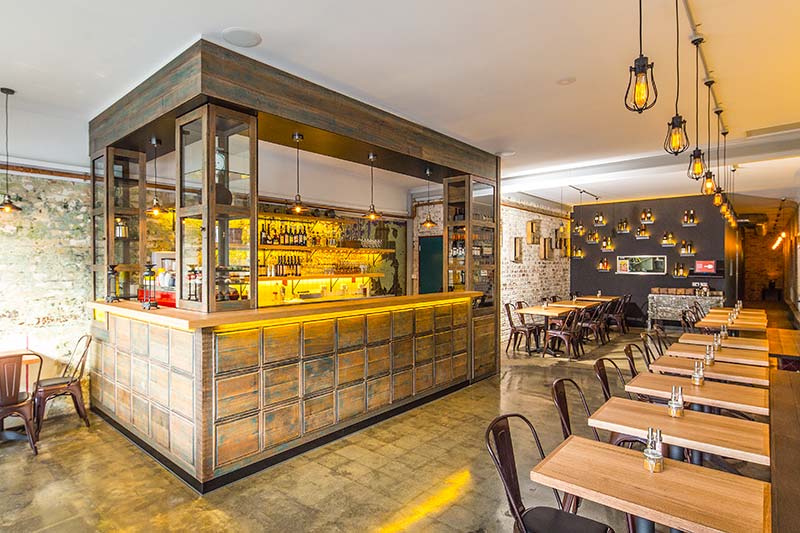
Being a proud hands on chef, cooking to her national style KVA believed the dining space should reflect something of a modern interpretation of a small venue from Spain within the context of the modern upcoming northside of Melbourne. The warm and rich colours are coupled with deliberately distressed and aged joinery elements.
Attention to detail became important, as a reflection of the detail and plateware that goes into each small meal. The design attempted to create a warm, dimly lit and intimate space for people to enjoy their tapas and wine.
The space is divided into zones to allow staff to focus on key elements of service. Bar, kitchen and waiter stations were designed for close contact with the dinners and enhance their experience. The client’s ability for her to focus on her work in the kitchen whilst having contact with the main dinning area was carefully considered.
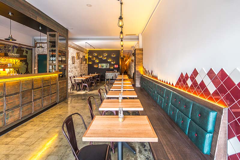
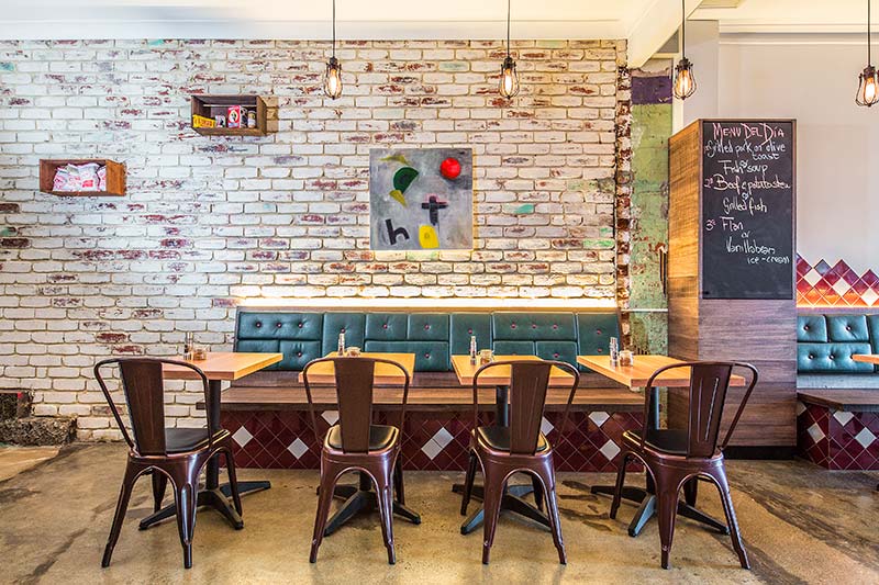
By using existing the brick walls and concrete flooring, as oppose to covering them, the design works with what was existing in the space. The existing location, previously a dress shop for 35 years, had many interesting qualities that were retained. This included the concrete floors and exposed brick walls. Plasterboard was removed from a wall at the front to uncover layers of history which included patterned green wallpaper and paint. New colours and materials, namely timber, green and maroon fabrics and tiles have been incorporated to create a cosy yet industrial atmosphere which suited the personality of the owner.
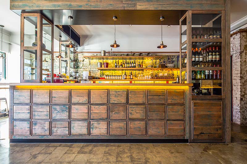
A mix of green and maroon coloured tiles wrap down the front window bench and are visible from the street. Behind this is the timber framed bar area.
The front bar consists of a timber surround inspired by traditional Spanish street bars. The existing wall behind the bar had a mix of old wallpaper and brickwork with a green paint – both remnants of the previous use of the space. The existing ‘green’ appears in various spots in the venue – including the timber of the bar, the banquet seating, bar tiles and corridor wall.
Some existing walls were a 70’s red brick so a white paint wash with speckles of green was applied. A green banquet seat runs along part of the brick wall and includes maroon tiles which colour matched the brickwork, and run below and above the banquet seating before fading away.
Shelves were incorporated at different points for display, including a rear blackboard wall with shelves for wine bottles and glass cabinets at the bar.


