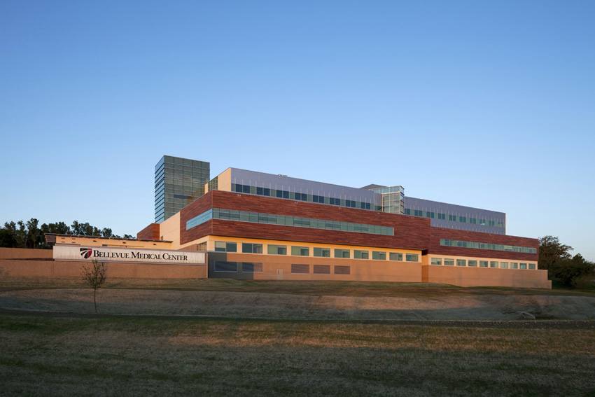
Architects’ Statement:
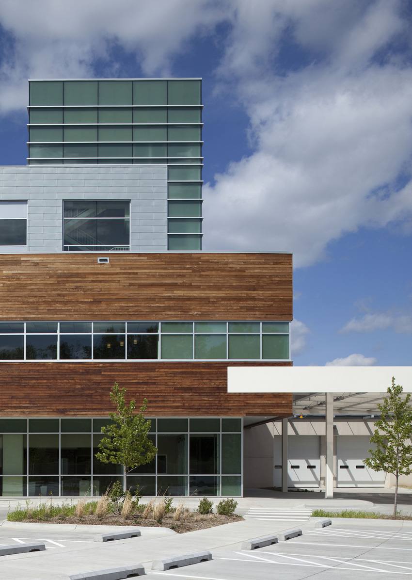
The style made famous by E. E. Roberts, Alfred Caldwell and Frank Lloyd Wright nearly a century ago was defined by a layering of horizontal planes inspired by the linear horizon of the native prairie landscape. It defined progressive design between 1893-1920.
Asked to design Bellevue Medical Center in the prairie style, HDR Architecture posed the question “what would Frank do today?” Surely he wouldn’t conform to a style that was progressive 100 years ago.
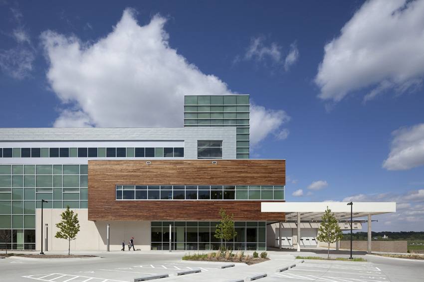
“Look to the plains P-L-A-I-N-S!” for inspiration someone said. The team did and found a dynamic world of landscape and vernacular images rich with texture, color and material. “Look to the planes P-L-A-N-E-S!” another person said. The team did and established a modern progressive discipline that was based on simple rectilinear forms. This modern assembly served as a kit of parts that helped establish a vocabulary which defined a language, allowing the team to create a holistic building that communicated from the inside out and the outside in. Common materials such as grasses, woods and metals travel from exterior to interior, creating a seamless progression from the prairie, to the building skin, to the interior environment.
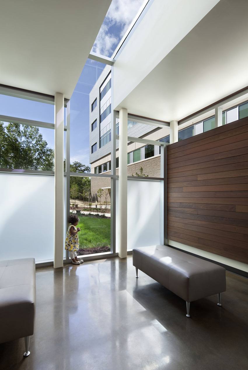
The setting is the Nebraska Prairie. Surrounded by the community of Bellevue, the building speaks not only to the people of the region, but also caters to the roots of the prairie. Swaying grasses, aged trees and a strong horizon set the stage for a progressive building that begins the new prairie school of the plains.
Zinc panels and Ipe planks are just two of the materials taken from the kit of parts to create texture and screens for the exterior. Cast concrete relief proportions mimic the natural slate patterns seen on the interior of the building, carrying a strong design language throughout.
A distinctly modern interior, it evolved from the strong foundations of the prairie school requested by the client. It displays strong horizontal lines but in a gesture to the hills of the Missouri River Valley and a critical take on the original school.
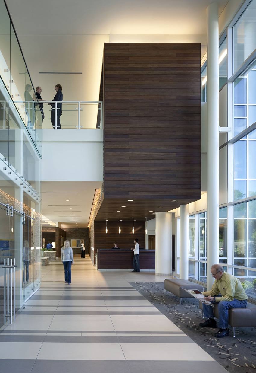
The fold is introduced allowing planes to trace contours that define and organize interior spaces and volumes. Form, space, and light merge to become a welcoming space where patients & visitors can enjoy a latte, check their email, or take pleasure in the views to the surrounding landscape.
Images of stacked stone walls, farm houses, and creeks are abstracted and translated into a winding, soothing water feature cascading through the lobby. The perimeter is defined by dry-stacked stone and slatted wood benches that soften the determined modern geometry. Blades of bluestem become silhouettes suspended in transparent 3-form panels and all is warmed by defining elements clad in the rich color and texture of Ipe wood decking.
Folded planes and rich materials are not just for public spaces. Patient rooms reflect all of the design principles established, boasting prairie grasses, rich wood grain textures, and open views to the Nebraska plains. Strong horizontal lines are repeated in the casework design, while native materials such as rounded river stones adorn patient room entryways.
With a fresh take on Prairie style design, the design team has created an environment that truly reflects the region and gives a nod to the original school of design. In the quest to merge the best of hospitality and healthcare, it’s safe to say that Bellevue Medical Center adds the “ity” to Hospital quite nicely.
Project Details:
Location: Bellevue, Nebraska – USA
Type: Health – Public
Architects: HDR Architecture – www.hdrinc.com
Client: Bellevue Medical Center
Size: 266,000 SF
Photography: Assassi Productions, Santa Barbara, California
General Contractor: Kiewit Building Group, Omaha, Nebraska
Consultants: Leider Consulting, Stillwater, Minnesota; Cini-Little International, Germantown, Maryland; Threshold Acoustics, Chicago, Illinois


