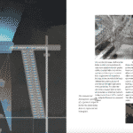
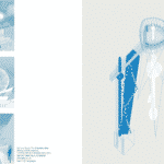
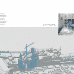
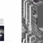
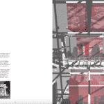
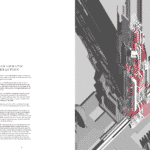
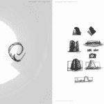
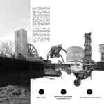
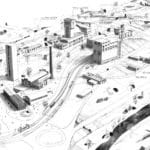
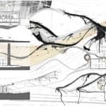
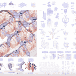
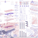
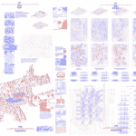
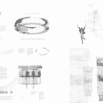
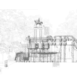
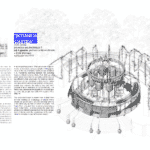
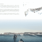
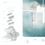
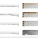
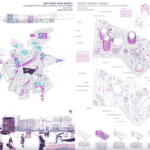
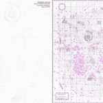
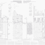
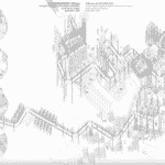
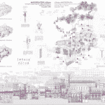
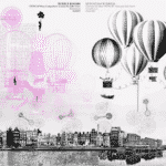
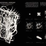
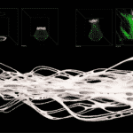
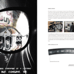
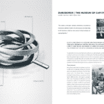
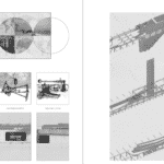
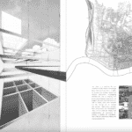
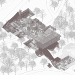
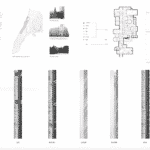
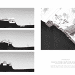
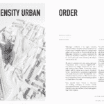
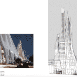
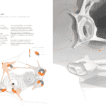
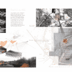
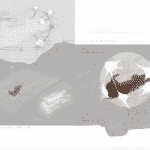
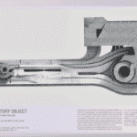
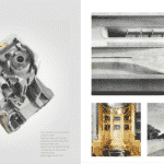
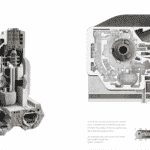
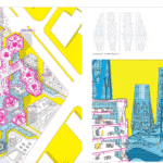
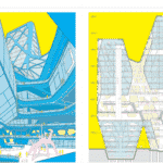
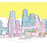
If one seeks the perfect architecture position, one simply needs the perfect architecture portfolio, and the following architecture examples, covers, and designs will be an excellent architecture portfolio guide.
A portfolio is something unique, a glossary of our personality, our thoughts, our creative thinking process, and our ability to express ourselves through different mediums. We all are different, and we certainly have had our differences when it comes to architecture in both built projects and ideology; as a result, every architecture portfolio is different. Yes, an odd “all are flawed, all are perfect” situation applies in this case too, a selection of the best architecture portfolio examples and their covers has been collected off the public domain to exemplify this.
Please take note that all these are public architecture portfolios that individuals have bravely shared with the world, They are all unique and they are all envisioned for a unique ideal job; these paired with a clever and creative business card and a well-thought résumé might prove valuable to a certain scenario but they will certainly be not valuable in all scenarios. Your design abilities will be measured by each office differently and so it will be your style, these means of expression are merely food for thought.
Today, as we launch this resource we also trigger a Call to Action to all Architecture Lab readers, we invite you to send your portfolio for inclusion on the page, if it is creative enough, if its expression is “colorful”, it will be nestled here.
Keep in mind that the architecture portfolios below and the ones that will be added in time on this page are not judged from a project design point of view, we simply choose an expression that sends a message, attractive illustrations, graphics, clear presentations that speak about the design contained, a proof of visual identity and authenticity on the owner’s behalf, creativity, unraveled.

More details @ infolie.tumblr.com
Architecture Portfolio Tips by Architecture Lab
Before we step into line and color, we will highlight a few tricks and tips for your architecture portfolio, cast a glance!
- Contents and Length. It is a time-consuming task as everything revolves around the world of “architecture” yet where’s a will there’s a way.
Keep that in mind.
Too often the first portfolio includes everything that the individual ever created. A big mistake. Approaching a firm requires presenting the portfolio in the interview, and a short brief via email, [at least] a two-page architecture portfolio. The solution? For two portfolios, you need your best in the brief and the best two, three, five following in the extended version. A third architecture portfolio could be presented online, an online version readily available through a link of each could often come in handy.
- Mistakes and Typos can occur easily under stress, so it is always advisable to ask a fellow architect to proofread your work, better safe than sorry.
- File Size can be a problem as you well know by now, big files are problematic. The exact file size for each submission might be different but keeping the file size below 15MB should help a great deal.
- Creative Flow is truly important in a portfolio but this should never negatively influence what you are actually attempting to showcase, stay focused.
- Graphic Focus & Balance. Yes, there are architecture portfolios that put an emphasis solely on technical drawings, illustrations, renderings or concept sketches but keep in mind that they were envisioned in such a manner, they showcase strength and you will definitely want to do the same. You send a portfolio tailored for a position in an office, imagine what the portfolio should contain to obtain the right response. You can always create a rendering architecture portfolio and a technical portfolio for different practices.
This being said all portfolios should have all the pieces of the creative design process in place. One simply displays that he fully comprehends the process and has the versatility to adapt to a new task if need be whilst his strength in a certain area will be highlighted accordingly.
- Layout. Always strive for a clean expression, avoid clutter, and embrace white space.
If you want to avoid white spaces the design piece ought to be easy to digest, a quite hard task [definitely not impossible] to achieve considering the multitude of elements that a portfolio shelters. Pay attention to structure and readability, the architecture portfolio will tell your story.
- Cohesion+Details. Design strengths lie in the details, by now, we know it. Use certain design motifs and cues all across your portfolio to generate cohesion, identity, and authenticity.
- Print. Print it. Print it at least once to see it yourself, it is an archive of your own creative thought process, and having it in your library would be a great feat.
A common practice is to send a copy of your print portfolio to the office of choice, do this only when you are certain that the portfolio and the officer are in sync,
Best Architecture Portfolio Examples, Covers, Designs
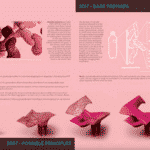
Sebastian Comanescu
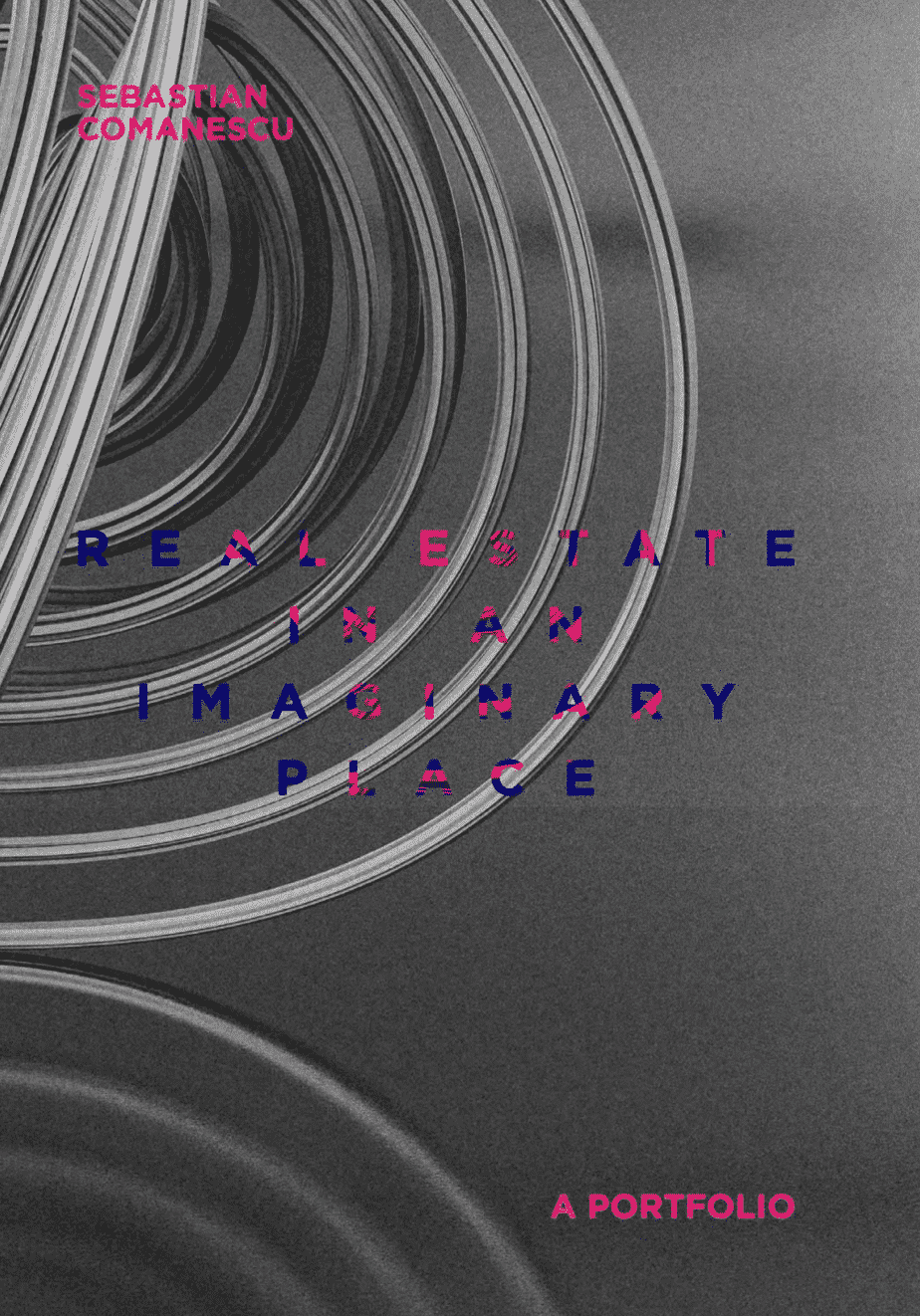
Design-wise. Color is hard to master and one could argue that parametric design is too, the blend between the two makes them great justice in an ironically playful expression.
What we like. The entire portfolio presents a case that materializes as we progress, playful deeply conceptual pieces become “small” grasshopper installation experiments only to later end with the markets’ demand, real estate.
A playful ironic game of imagination and reality, a great display of skill.
See the full portfolio on issuu here.
Luca Gamberini
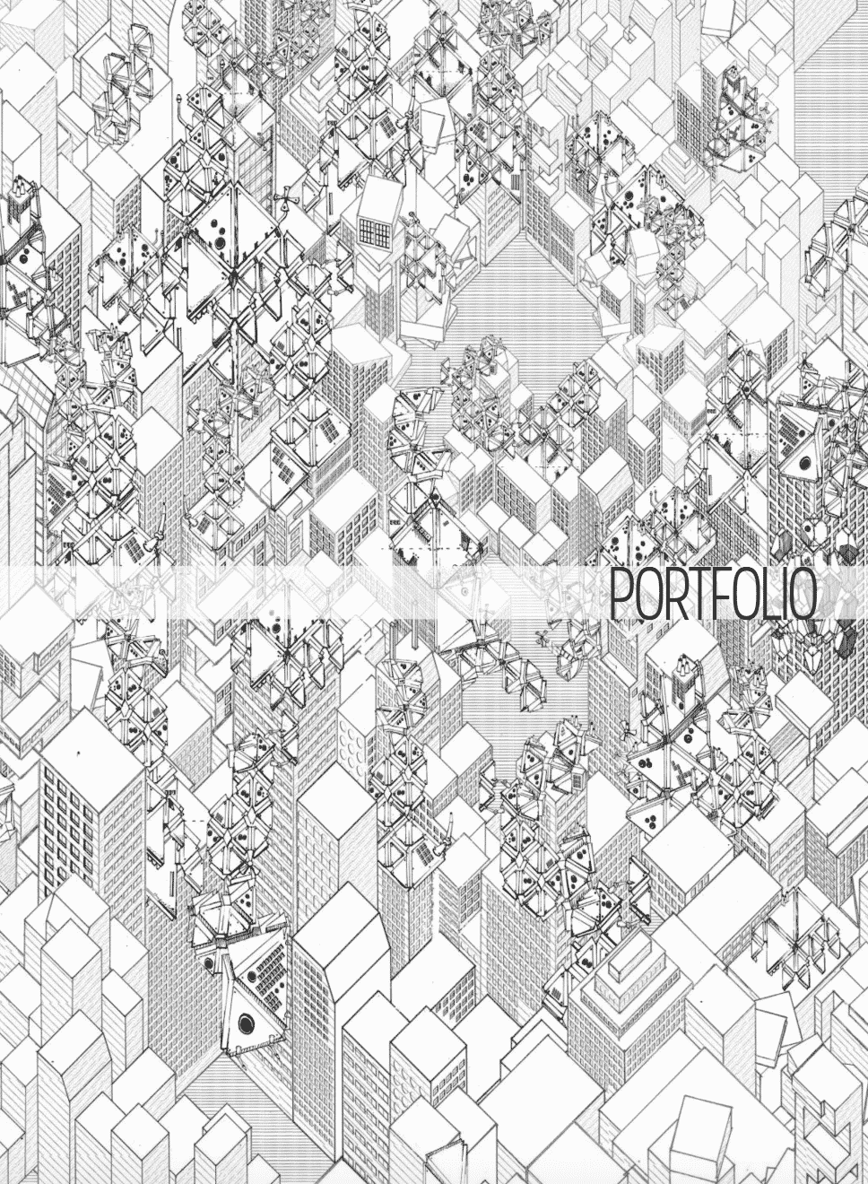
Design-wise. A sublime balance between color and line in a rather rich-detailed expression.
What we like. Sculptural organic designs set the tone yet white space maintains its strategic place, detailed sections and exploded axonometric designs immerse the viewer into a future world.
See the full portfolio on issuu here.
Nikolas Ward
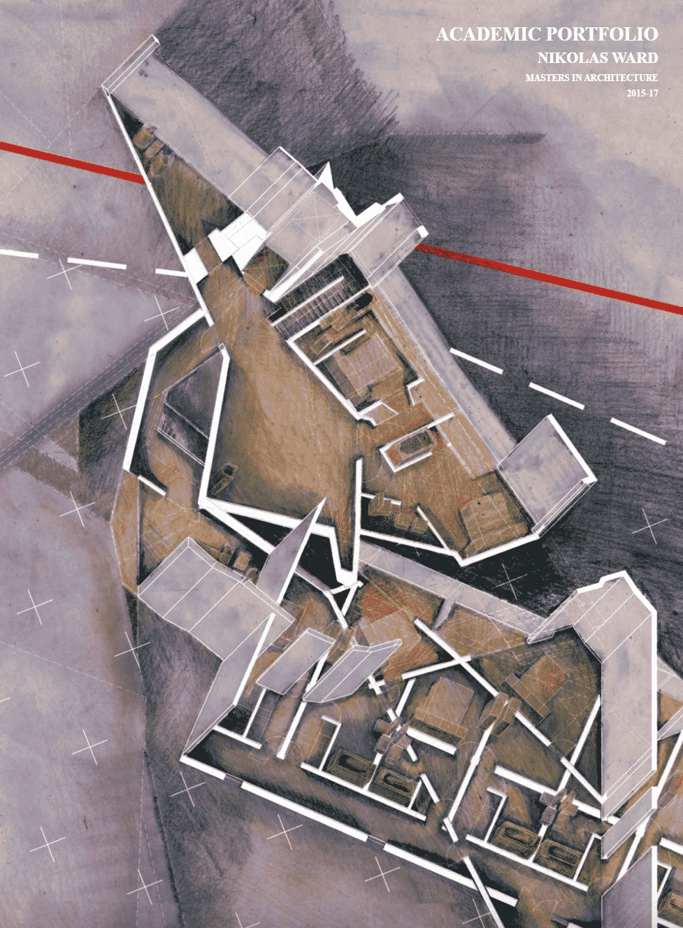
Design-wise. The architecture portfolio cover design presents a section of a home, an evolutionary patchwork-process-patchwork yet the components present a clear expression, individually tailored around each project.
What we like. The use of one color to present an entire project along delicate lines is sublime, the cohesion of the entire portfolio strengthens it.
See the full portfolio on issuu here.
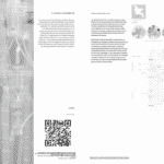
James Richard Street
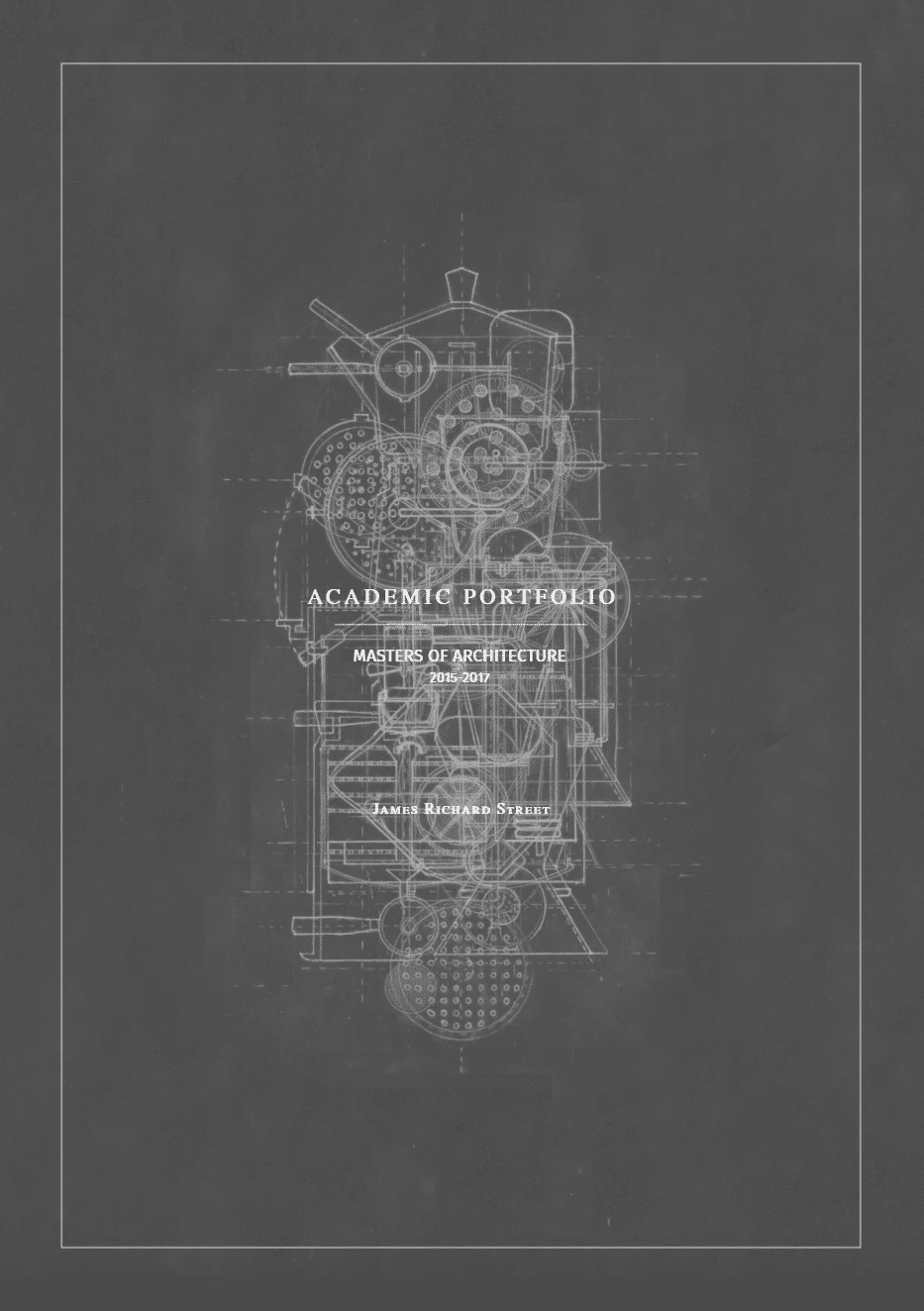
Design-wise. Grey sculpts an expression inspired by Metropolis’ theme, it brings forward color to create contrast.
What we like. Coherent payout and great balance between text and illustrations whilst honoring white space, great attention to details, and information-rich content.
See the full architecture portfolio on issuu here.
Ali Karimi
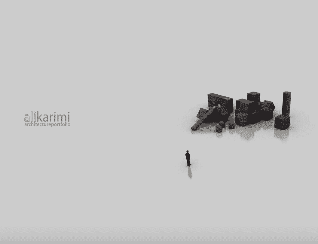
Design-wise. Integration between digital and traditional techniques is seamless and natural; the hand drawings, the sculpture, and its photography are key parts of an online portfolio.
What we like. A huge emphasis on symbolism, motifs, and monumental roots the portfolio into place and greatly welcomes the traditional techniques
See the full architecture portfolio on issuu here.
Anton Giuroiu

Design-wise. Dense information-rich portfolio expressed through different techniques, immersive progression from one page to the other.
What we like. A patchwork of techniques and expression attempts that describe easily the site and the overall ambiance of the project.
Full portfolio not available.
Carlos Lozano Canella
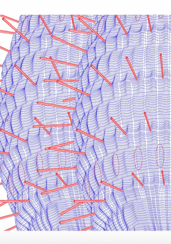
Design-wise. Showcase skill in a creative playful color scheme with an extraordinary level of detail and information.
What we like. The use of color in a wire-frame progression, the blend of volumes in a coherent composition dominated by wire-frames seamlessly. Emphasis on the evolutionary design process and its structure.
See the full architecture portfolio on issuu here.
Adrian Montoro
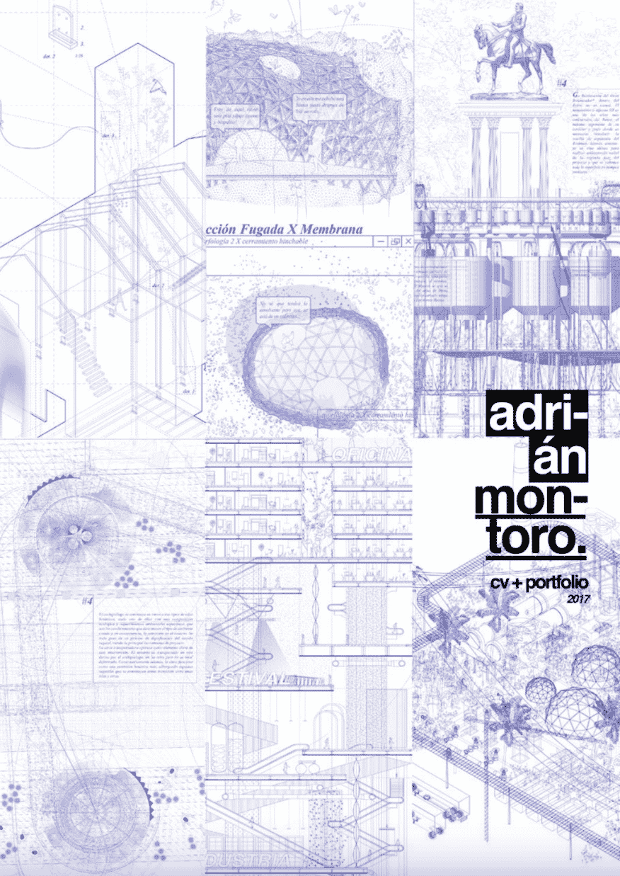
Design-wise. Delicate wire-frame expression filled with details, a technique mastered in color and black and white, atmosphere-rich designs.
What we like. White plays its role along the thousands of lines that embrace both line and color, where solids are used, they create great depth and instantly grab the viewer’s attention.
See the full architecture portfolio on issuu here.
Jason Wu
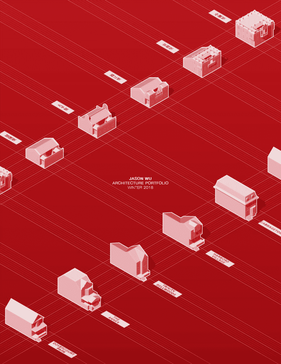
Design-wise. Sharp renderings take the pedestal and silently support delicate facades, sections, and model pictures.
What we like. The layered concept scheme and crisp renderings are making the architecture portfolio great justice, model photos side to side with facades and sections work great.
See the full architecture portfolio on issuu here.
Claudia Conde
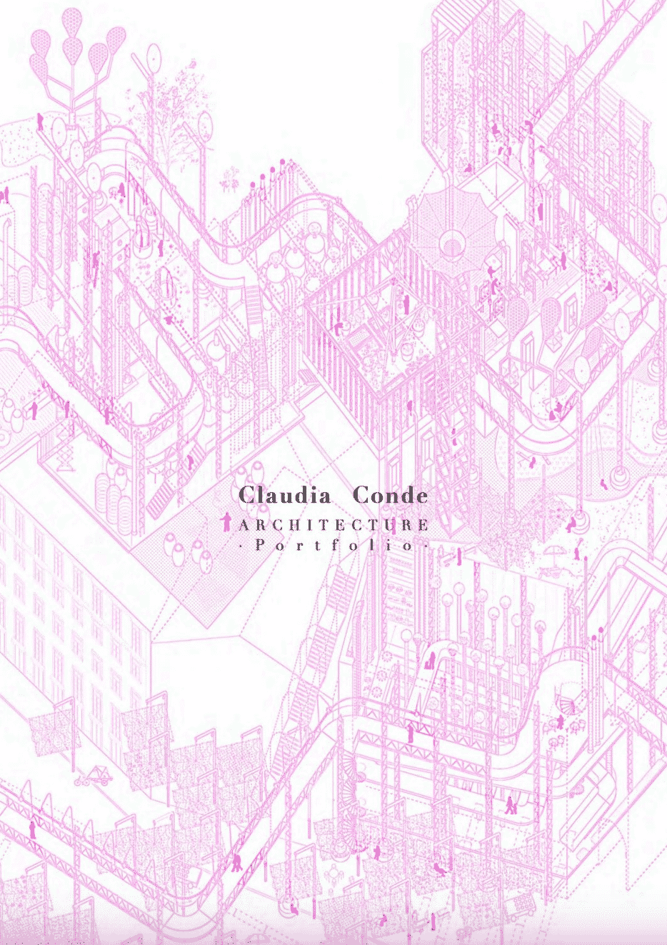
Design-wise. Exceptional wire-frame expression coherent throughout the portfolio embracing a contrast between white space, pink, and grey palettes.
What we like. A delicate detail-rich approach that flows and exudes creativity at each step, all design elements are tailored one onto another creating great compositions that narrate the project’s atmosphere.
See the full architecture portfolio on issuu here.
Marya Filatova
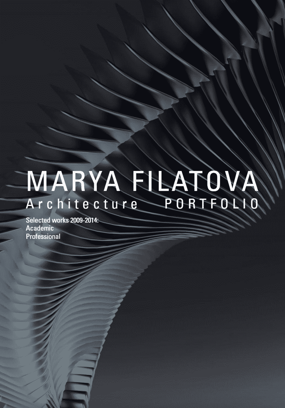
Design-wise. Sculptural organic sequences shine in the portfolio, each project is presented differently at the cohesion’ expense, a stark presentation technique.
What we like. Contrast brings forward the design and highlights authenticity, color is brought forward to explain complex designs.
See the full portfolio on issuu here.
Artur Zakrzewski
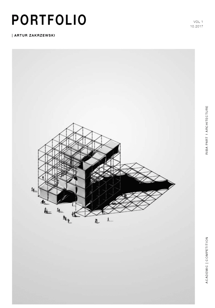
Design-wise. Boldness and strength define the expression of this architecture portfolio, a clear stance expressed clearly, sharp stance.
What we like. Renderings and attention to detail feel at home here, they dominate the portfolio and as a result, a clear message is broadcasted.
See the full portfolio on issuu here.
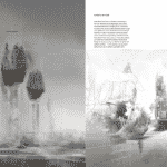
Jaron Popko
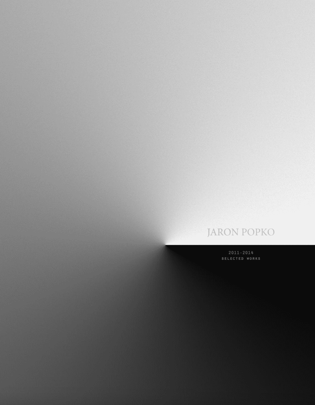
Design-wise. Black, gray, and white palettes dense through texture are used throughout thus setting a coherent motif, spikes of color highlight certain areas.
What we like. In the layered approach, notice how extraordinarily small changes in texture or gradient present clean, simple designs impeccably.
See the full architecture portfolio on issuu here.
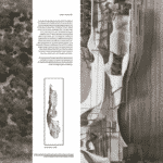
Chung-Yi Lin
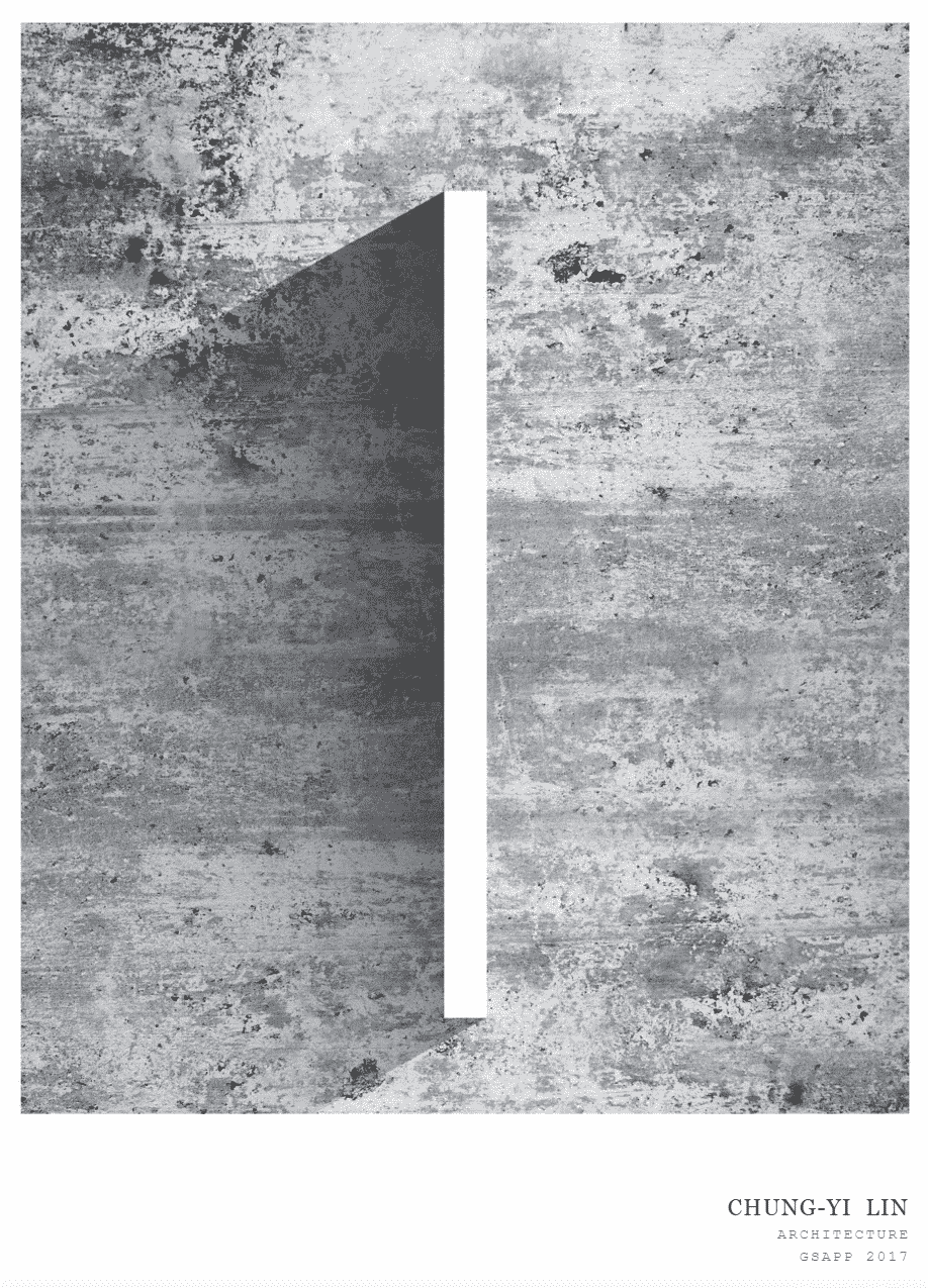
Design-wise. The subtle presence of textures and transparency play is bringing the composition forward.
What we like. Great attention to detail and the beautiful, delicate balance between the pieces, constant cohesion expression throughout the architecture portfolio.
See the full architecture portfolio on issuu here.
Jamie Edindjiklian
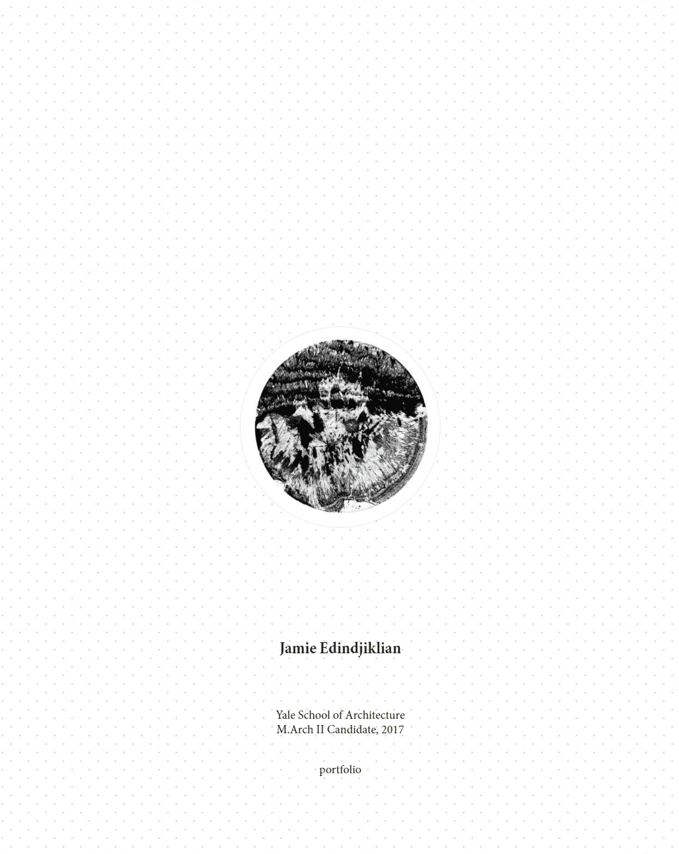
Design-wise. Magazine-inspired layout serves different design pieces greatly in a natural progression, a natural order.
What we like. Complete approach, all pieces of the design are clear and coherent despite their different expression, a hard, dense, and information-rich project easy to digest.
See the full architecture portfolio on issuu here.
Yiran Zhang
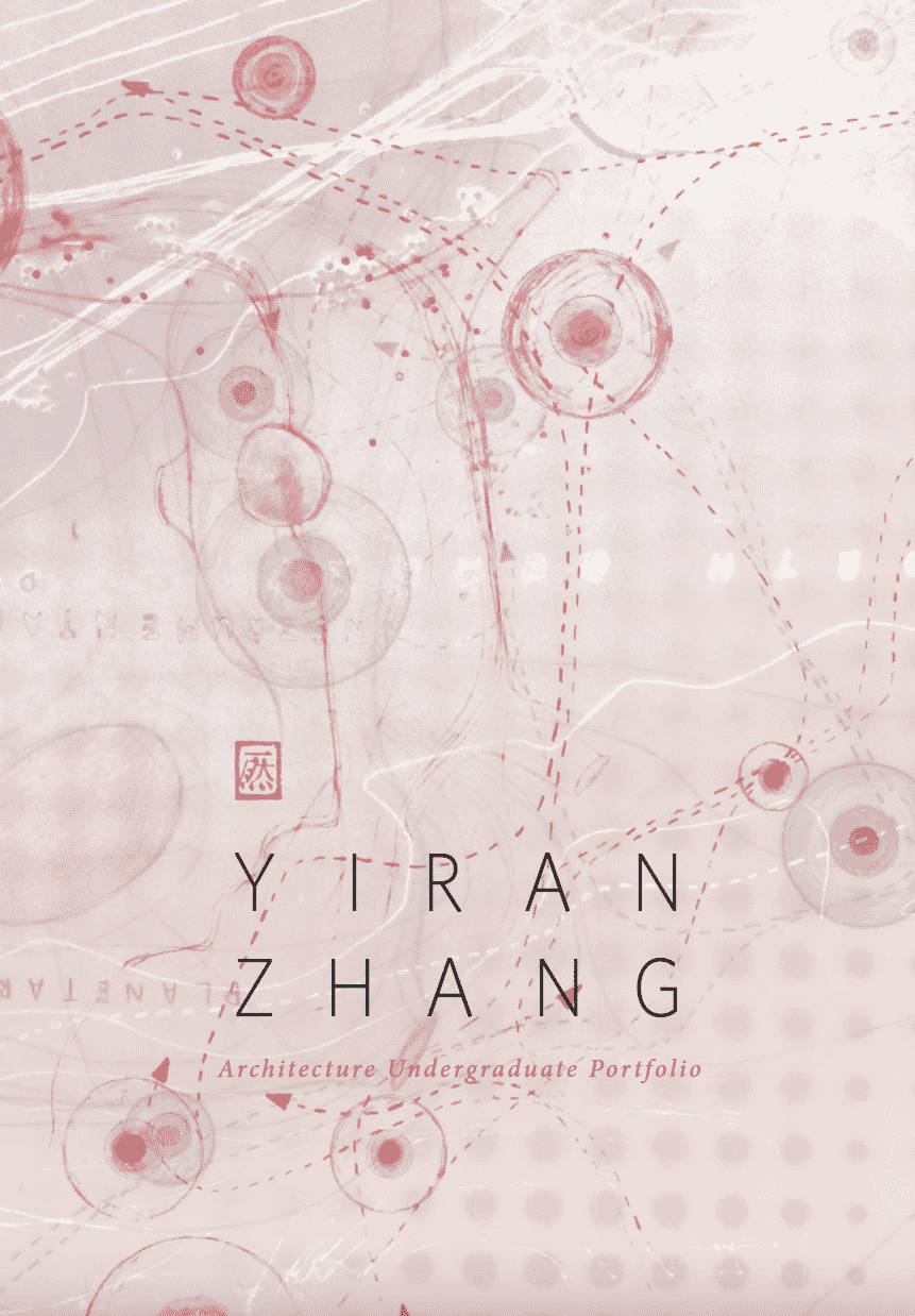
Design-wise. White and grey alike are bringing the design forward creating subtle contrasts that highlight the sculptural shapes, orange accents represent the cherry on top.
What we like. Coherent representation is a good showcase of how different techniques and project pieces can support an architecture portfolio design.
See the full portfolio on issuu here.
Phoebe Hiu-Nam Leung
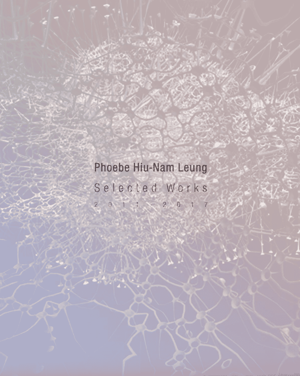
Design-wise. Realistic renderings set the tone and ambiance, they’re silent solitude play draws one attention rapidly. Cohesive design, surreal expression.
What we like. The material feel of the 3D pieces is incredibly realistic and they simply cannot be overlooked, overall design expression infuses calm, and quietness.
See the full architecture portfolio on issuu here.
Greg Whitney
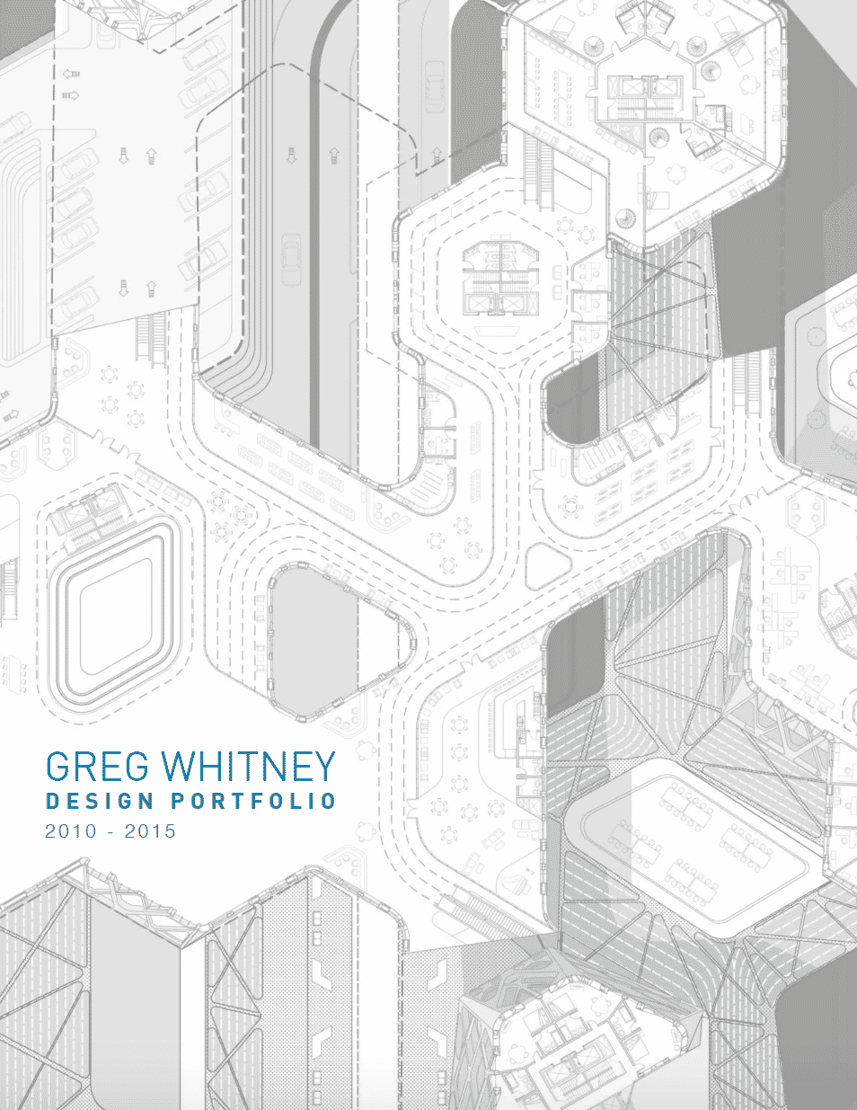
Design-wise. Bold pop-art-inspired colors bring the portfolio’s design forward, and contrasts create an atmosphere.
What we like. The balance between color and line detail is masterful, it creates a great focal point that gathers the viewer’s attention in a glance, stops for a moment, and looks at the buildings’ surroundings.
See the full portfolio on issuu here.
Solange Knowles

Design-wise. Simple yet delicate as a meaningful expression, the portfolio above takes the approach of a journey one ought to follow.
What we like. One can surge inspiration from various other mediums in shaping the perfect portfolio, While the one above does not fit the architecture portfolio category, an artist surely could find it interesting, to cast a glance at how a simple journey, expressed in words is being shaped creatively, how it becomes graphic.
See the full portfolio on issuu here.
No two architecture projects are identical, no two architecture portfolio samples or portfolio covers can be identical; the examples above are standing proof, fruit for one’s imagination.
How do you see these architecture portfolios and which one do you like the most?
Do you there is such a thing as a perfect portfolio?
We would love to hear from you in the comment section below from architecture students and professional architects alike!

