When it comes to decorating our homes, Art is an inevitable part of completing any look.
However, not everybody has a good eye to tell what looks beautiful from what doesn’t. If you’re one of them, you have probably struggled many times trying to “get it right” before finally settling for a decent decoration.
But today, we are going to list out 9 of the most common and amateur art displaying mistakes that you can avoid. Rest assured, you don’t need to have skills or creativity for this; just follow our short guide below.
Amateur Art Displaying Mistakes

-
Trying to fill up every wall in the house
Filling up each and every wall in the house with art is definitely not what you want to start off with, except if you’re an art collector.
Some people may think that the more the paintings, the more beautiful the room gets. As exciting as it sounds, this concept just adds a lot of colorful, unnecessary complications to the room.
The best solution for this dilemma is to hang lesser art pieces that either complement the vibe or have a sentimental meaning.

-
Matching everything
The whole idea of having art in the room is to get away from the confined beliefs such as matching colors perfectly. We urge you to explore the beauty of mix-matching colors and let your piece stand out for people to notice it.
This doesn’t mean the art should be extra colorful with fluorescent hues, but it’s simply diverting from the rest of the shades inside the room.
-
Disorderly hanging your art
There are many creative ways to display a piece of artwork but the most common one is hanging it on a nail.
We’re not saying it’s either right or wrong, but that’s not the only way it is supposed to be. Many a time, using a single nail is the reason why art pieces either tilt or fall down when there’s a thump or a door slam.
Also, it is not always required to frame the artwork and make your home look like a strict modern hotel/restaurant.
So if you’re asking what to do, we would suggest asking for opinions or finding your own judgment on what would look better for that particular artwork.

-
Keeping the art way too high up
One of the most common mistakes people do while displaying a piece of art is to hang it way too high, making it sit there all alone in a pretty awkward manner if we have to add. But the good news is that this mistake is pretty easy to fix.
If you want to make the house seem more sophisticated and elegant, check out different sources and videos about the right height to hang your art. Note that this will totally depend on the size of the painting as well.
-
Lacking diversity
The last thing you would want your pieces to be is identical which means they have no variety in content and shapes. Known as the art gallery effect, this kind of display is simply boring.
What you can do to escape it is to actually spend time hunting for different artworks that portray different ideas and content. Also, try out tapestries, canvases, or pin-up quilts in order to make your home look lively.
-
Putting all the focus only on walls
If you just got an apartment or a home of your own and want to include art pieces, this is the first mistake we do not want you to make.
Just because the wall is the first place that comes to mind when thinking about hanging art, that does not make it the only place whatsoever. Instead, it would be a good idea if you started to take a few artworks from the wall and place them somewhere else in the house to see major changes in decorations.
-
Unsuitable size
What can be mildly infuriating or uneasy is seeing a small piece of art in a room that needs a bigger piece. Fixing it will require some reframing to be done or a much simpler way to do it is by placing a mat behind the artwork; keep in mind that choosing the canvas prints or paintings with the room in head from the very beginning is ideal.

-
Not fusing the art with its surrounding
Making the art stand out for people to notice is completely different from not blending it into the surroundings. A room is better off on its own rather than having an odd-looking piece of art inside.
Here’s where you need to use your judgment to find out if the artwork will complement the object next to it or vice versa. However, make sure to keep the decoration light and simple.
-
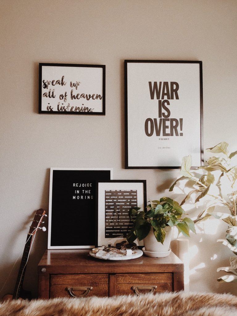
Unplanned wall collage
Coming up with a wall collage is not as easy as it looks. You need to have precision over the measurements, especially if you’re using any measuring tool.
Use any trick that works best for you as long as it gives amazing results. Make sure to do another round of checking before making holes to hang pictures and artwork.
And there you have it! We hope you found this quick guide helpful and if there is still some doubt, feel free to contact us with questions!
Until next time!
Related Articles


